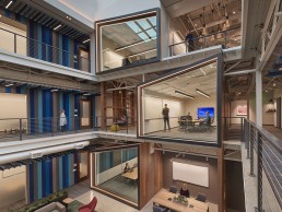
Private Company Workspace, USA
When it comes to modern workspace solutions, the world’s largest tech companies have long been seen to be leading the way. The likes of Apple and Google are regularly cited for their innovative workspace designs that veer away from the traditional office format for something altogether more creative.
This trend is once again on show in the renovation of Buildings 121 and 122 on the campus of one high-tech company in Redmond, Washington.
Formerly a labyrinth of formulaic private offices, the redesign opens the building out into an intelligent workspace built around an open office concept. The new look space blends plentiful natural light with dynamic artificial lighting, and was part of a move by the global tech company to bring the two buildings into alignment with its modern design philosophy, founded on the idea of creating welcoming atmospheres that are rooted in their local environments.
As such, the newly designed buildings are inspired by two ecoregions within Washington State – the Olympic Rainforest and the Cascade Rainshadow – products of the two mountain ranges that flank the Puget Sound region. These regions are incredibly diverse – a few hundred miles from each other, one is characterised by tall evergreen trees, trailing mosses, fallen trees and filtered light, while the other features open views, deep gorges, caves and large expanses of open land dotted with barns and silos.
The architectural design therefore looks to explore the effects of light, form and materiality as interpreted through these lenses, while incorporating features that reference human activity and adaptation to these regions.
Integral to this is the lighting design; developed by Dark Light Design, the new lighting helps to convey a sense of place, while complementing the unique design and personality of each building, using techniques layered for visual variety throughout.
Brought on board by B+H Architects, whom Dark Light had previously collaborated with on other projects, the lighting designers were tasked with creating “an engaging space for employees and visitors, that supports innovation and collaboration, meets the very aggressive design and construction schedule, and meets the client’s desire to provide a sustainable workplace,” explained Jill Cody, Principal of Dark Light.
In the middle of this, Dark Light had to ensure that the new scheme would be in keeping with the wider design philosophy of the company. Kristen Hagland, lighting designer at Dark Light, explained further what this philosophy entails: “The philosophy is grounded in creating engaging, comfortable spaces that are accessible to everyone.
“There is a natural and familiar design language that is rooted in its local environment, but that also reflects the brand’s aesthetic. Work areas should be treated with great care and attention, rather than all focus being placed on gathering areas. Lighting is viewed as an essential tool to bring the right personality and atmosphere into each space.”
Because of this design philosophy that the client sought to instil into the fabric of the new-look buildings, the overall design schemes were developed in collaboration with the company, with lighting forming a part of that collaboration. However, because of a very short timeline – the project took just one year from design commencement to construction completion – Dark Light had no preconceived lighting concept. Instead, Cody said that “the design process was not a linear one, the design was very iterative”.
“While this meant that the design was still evolving even as construction was commencing, the entire team was in the same boat, so we all worked together to come up with solutions,” she added.
Although the renovation spans across two buildings, it was important for the design narrative to remain consistent between the two. As such, Cody explained that there are many common design elements between the two buildings, such as in the treatment of the open offices.
However, while there are some commonalities in design, she added that lighting design has actually been used as a means to differentiate between the buildings. A key example of this being found in the rectilinear conference room “huts”, that project out into each building’s central atrium. “In Building 121, they are outlined with a direct linear fixture that creates a graphic reveal of the room’s geometry, while in Building 122, the lighting detail is turned more inward, with indirect light to reveal the wood material while still gently highlighting the shape.”
Elsewhere, the buildings feature a blend of both architectural and decorative lighting elements. Large pendants in the breakout and casual spaces create a more relaxed, homely effect, while the open office areas are illuminated by a mixture of downlights and suspended linear fixtures from the likes of CSL, Reggiani, Tech Element and Vode.
In these areas, Cody believes that by keeping the lighting arrangements flexible, it can help to foster a more fluid, creative environment. “In this case, as in many other workplaces, the open office areas need to be flexible to allow teams to move and restructure as necessary,” she said. “We needed to provide adequate light throughout each workgroup’s space (which weren’t always regularly or efficiently spaced) to allow that flexibility.
“The existing structure’s low ceilings provided an added challenge. The architectural team developed a scheme with punctured openings to the acoustic ceiling clouds. The low ceilings, coupled with the irregularly located openings precluded the use of an indirect lighting solution, yet we still wanted to create an interesting and engaging lighting solution. The rectangular frames, in different sizes, allowed placement of light where it was needed, and created a visual interest beyond the usual expected in an open office environment.”
By using a mixture of decorative and artificial lighting elements, at varying light levels and luminances, the lighting designers were able to bring a sense of variety to the space, creating a number of new zones, each with their own ambience. This is something that Cody feels was an integral part of their design approach.
“One of our big concepts was providing visual variety to employees and visitors – especially employees, who spend a great deal of time in these facilities,” she said. “Designing different types of lighting in terms of light levels, fixture luminance and contrast in the space is important to us, so that employees have a chance during the day to experience some visual relief when they leave their team space to go to a meeting or take a break. That may mean a relatively low light level in a lounge space, more luminous light sources in communal collaboration spaces, or higher contrast in circulation spaces.”
The use of a non-standard grid-like layout for the lighting within the open office areas adds additional moments of intrigue even from outside the building, with the arrangement of fixtures creating a fascinating pattern of light.
Dark Light’s artificial lighting designs are complemented by vast skylights within the inner atrium of each building. However these skylights were a new addition, implemented by B+H Architects, alongside contractors Howard S. Wright. Prior to this, the building was incredibly dark, with little to no natural lighting in the innermost areas of the building.
To create these monumental skylights, B+H Architects used a series of daylight studies, along with a robust Revit model to create an immersive virtual reality experience for the client, which also allowed the entire design team to collaborate on the size, shape and feel of the new atrium spaces. The architects and contractors then had to cut through the structural slab of the building, across three floors, to create the airy new atriums that vastly improve the flow and feel of the spaces.
Dark Light complemented the new skylights by introducing daylight responsive lighting controls throughout. This helped contribute to the new lighting scheme aligning with the client’s high value on sustainability, while lighting power consumption is also 20% lower than Washington’s rigorous energy allowance.
In recent months, the world has entered into a state of uncertainty, especially surrounding the role of the workspace, as companies around the world have been forced into working remotely. However, as the signs of a post-Covid world are slowly starting to emerge, Cody believes that open office concepts, such as can be seen here, will continue to be the norm for workspace design, as long as they remain flexible.
“What we are seeing now is an even harder push toward reconfigurability in open office spaces,” she said. “Design teams are being asked to provide layouts for Covid and post-Covid configurations. Any lighting scheme that is tied to a furniture layout seems doomed. Although I personally don’t think the physical office is doomed, I do think that a post-Covid world will definitely have more video conferencing than before – so we need lighting that addresses that, and we need to continue to look for ways to make sure that people of all skin tones look good on camera.”
Since completion of this project, Dark Light has received a great deal of praise within the lighting design community, including an IALD Award of Merit at this year’s IALD International Lighting Design Awards. And for good reason – being given the task to create a workplace that supports innovation and promotes sustainability, and does so in a dynamic fashion, is no mean feat, but Dark Light has achieved this, creating a lighting scheme that complements the new architectural additions, and enhances the space for both visitors and employees alike.
And Cody was eager to share the praise with the rest of the design team involved. “We had an amazing team of collaborators all around,” she said. “The architects, interior designers, landscape architects, electrical and general contractors and owner were all part of a team that had to work nimbly throughout design and construction.
“We were fortunate that they understood the importance of lighting, both from a technical and experiential standpoint, and that helped develop the amazing space that resulted.”


