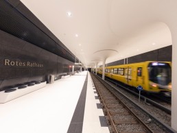
Rotes Rathaus, Germany
The bright, monochrome finish within Berlin’s new Rotes Rathaus subway station is a bold contrast to its historic setting, with a complementary lighting scheme from Licht Kunst Licht.
The Rotes Rathaus (Red City Hall) in Berlin is a new subway station that connects the main station of the government district to the Berlin subway station. Designed by Berlin-based Collingnon Architektur und Design, the station opened in December 2020 after more than 10 years of construction. With lighting design from Licht Kunst Licht, the station was transformed into a public space that aids flexibility in movement and safety.
Back in 2010, underground remains of the gothic styled town hall were discovered. In a bid to conserve the historic structure, it was decided to preserve and incorporate it into the new architectural design. After numerous revisions, the final agreed upon design led to the development of a mushroom-shaped column structure that mimicked the original vaulted ceiling.
The new design for the station revolves around a simple yet dramatic black and white colour scheme. Boasting gleaming white floors and ceilings, dark and subtly sparkling walls made of polished concrete, the anthracite-toned staircases remain in dark colours to add drama, which results in a radiant reception flooded with light when entering the 140-metre-long station hall.
arc caught up with Edwin Smida, project leader from Licht Kunst Licht, to discover more about the studio’s approach to lighting the space. Continuing the lighting studio’s established relationship with the architect, Licht Kunst Licht worked closely with the architectural project team to create three proposals to fit in with the ever-changing concept.
Deciding to not use additional, complex lighting structures, the lighting design simply consists of integrated downlights in the concrete ceiling. The calculated interplay with the reflection from the white floors and ceilings produced the desired, pure lighting effect along with a high level of visual comfort for passengers and station staff. Luminaire wattages and beam angles were adjusted by Licht Kunst Licht to ensure each fixture was correctly fitted across the varied ceiling heights in the hall and on the side wall of the connecting bridge. Platform ends, where ceiling protrusions prevented the use of downlights, were fitted with pairs of inground luminaires.
“Initially, the architect wanted a light ceiling appearance, and asked whether the light should come from the cove at the edge of the mushroom columns. We rejected this idea because it would have focused too much attention on the columns. As an alternative, we put forward the idea of using downlights for the general lighting on the platform and using the indirect reflection of a brightly painted floor for the ceilings,” said Smida. “At first, the Collignon office was a little sceptical about whether this could work, but we were able to show some images of other projects in which this effect was easily demonstrated. But, the radical reduction of the concept to simple downlights was convincing in the end, because we could foresee that the room itself would benefit from this effect.
“The project was not built from the bottom up as usual, but the other way around. This means that the ceiling was poured first with the mushroom columns attached, and then the soil from underneath was removed and the rest of the room was added,” continued Smida. “For the lighting, this meant that the concrete recessed housings had to be installed in the ceiling years before the luminaries. At the time of planning, we were still calculating with metal halide lamps, but in the end, contemporary LED luminaires were installed. The manufacturer, We-ef, mastered the balancing act between the early system coherence of the downlights and the concrete cast-in housings and the later contemporary lighting technology excellently. This was only made possible with close contact to the client and constant monitoring of the progress of the construction site. For this we must explicitly thank We-ef employee Detlef Herfter for his endless commitment.”
In the beginning, side diaphragm walls were built, followed by a waterproof concrete floor to form the bottom of the pit. A “cover” was then concreted over the pit to form what would later be the ceiling of the station. The flared support heads were completed early on, but the supporting columns grew in a later construction phase. This had consequences for the ceiling-integrated lighting concept. The first installation step was the mounting of concrete installation housings, which was carried out early on. We-ef delivered the customised modified housings in 2013. In addition to a formwork element for the recessed installation detail, they also featured additional entries for the redundant wiring. Later, operator Berliner Verkehrsbetriebe (BVG) decided not to take any risks as reliability was a top priority.
In 2010, it became apparent that LEDs would replace the HIT discharge lamps commonly used at the time. We-ef, the architects and lighting designers all worked together to select the future-proof LED technology. This also accounted for the emergency lighting to be seamlessly incorporated into the scheme. The lamps were finally delivered and installed in 2017 during the fit-out of the hall. A total of 70 We-ef DOC240 lamps were installed above the platforms. With 24 LEDs in warm white (3000K) and a connected wattage of a maximum 48W, they produced a symmetrical medium-beam light distribution. Additionally, there were more than 100 DOC220 recessed luminaires with 12 LEDs and symmetrical medium-beam optics in the areas with lower ceiling heights. ETC140 inground luminaires with 24 LEDs in 3000K were installed at the ends of the platforms and feature a non-slip ASC coating in accordance with DIN 51130.
Taking cues from the architecture, the lighting matches the modern aesthetic created by Oliver Collignon (head of the architecture firm), which was designed as a purposeful contrast to the history of the station’s location.
The monochrome colour contrasts continue to emphasise this modern look, and paired with the lighting, create an open, bright and comfortable atmosphere. “It’s charming to end up in a bright and friendly-looking room on the way underground,” said Smida. “Ours almost looks like a hall, the likes of which are usually only found above ground. But the way to the hall could still have a bit of drama, so it made sense to design the stairway slopes as connecting pieces in contrasting black. We never saw a problem here in terms of adaptation; the contrasts would have had to be much stronger. It was all purely intentional.”
Overall, the new station is not only a place of significance for Berlin commuters, but also as an iconic piece of design in the city centre.
“In virtually all of its projects, Licht Kunst Licht tries to focus on the lighting atmosphere rather than on the luminaires themselves. We always put our knowledge at the service of the architecture, i.e., we try to find a concept that works in harmony with the architecture. This principle usually produces strong and expressive results in which cooperation of the various trades is perceived as a unity,” added Smida.
It is safe to say that Smida and his team were able to achieve these studio-driven principles at the Rotes Rathaus station and create a stunningly simple lighting scheme under challenging circumstances.


