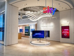
Sky Westfield, UK
Opened in December 2021, Sky Westfield is the first flagship store for the telecommunications company to showcase its new retail concept. With a lighting scheme from dpa lighting consultants, the store fuses traditional retail lighting with a warmer residential feel.
In retail lighting projects, the focus for designers is always to create a balance between highlighting the product and creating a welcoming environment for shoppers.
For its new retail store concept, Sky has taken that welcoming environment one step further, introducing a much more residential feel in order to effectively showcase its home entertainment systems.
The first flagship store to utilise this new concept, at Sky Westfield White City in London, was completed in December 2021, with the telecommunications company recruiting dpa lighting consultants to develop the lighting scheme.
Gary Campbell, Partner at dpa lighting consultants, explained to arc the brief for the new lighting, and how this shaped the final concept. “The client gave us quite a clear but simple brief, in that the new concept had to be flexible, with particular focus on the product displays, a lower ambience and more ‘residential’ feel.
“Since a big part of the product offer is home television/entertainment-based, it was important to try and achieve a slightly softer, more residential feel than normal retail. A CCT of 3000K and high CRI was considered very important, after testing a warmer CCT of 2700K that was deemed too warm for the overall design. The focus of the customer was to be at eye level, onto the product and not upwards to the ceiling, so there is an emphasis on integrated furniture lighting for visual interest and product highlighting. The concept then evolved a little to include feature pendant clusters over the key VM position.”
From there, dpa lighting consultants developed a lighting concept that saw a simple, flexible track and spot solution suspended within the open ceiling, using different beam angles as appropriate with anti-glare and beam shaping devices. This provides a varied light pattern with focused highlighting of the product displays and a comfortable, warm, ambient effect. At lower levels, linear halo lighting to display panels, backlit graphic panels or concealed lights underneath centre floor units provide further visual accent and interest.
The main space within the store also features two “hero pieces” in the form of semi-custom pendant features; based on a standard Orb pendant from Stoane Lighting, these have been adapted to operate with RGBW light sources. As standard they are set at warm white with a periodic sequence, with additional colour sequences for special events or times of the year also programmed. Seven specific Sky brand colours are included within the programming.
These feature elements, though striking in their final appearance, proved to be one of the larger challenges to actualise within the project, as Campbell explained: “The main challenge was in the sourcing and development of the RGBW feature pendants, and specifically how these would be installed structurally as two clusters together with their remote power supplies, drivers and controllers.
“This was quite an unusual one for the contractor, but we had great support from the suppliers, Stoane Lighting, and then Artistic Licence, which provided technical assistance, supplied the drivers and control system, and commissioned and programmed the pendants with the client and ourselves. It became a slight challenge from a construction programme perspective, but there was a great team effort to make it happen.”
These “hero” pendants merge with the more traditional architectural lighting elements to help create a warmer, more residential ambience within the store, and Campbell explained how this balance was achieved. “The buzz word these days is of course ‘customer experience’. The interior design had a more residential feel than would normally be expected, but it was still important to make a bold statement with the feature lighting to launch the retail brand, and with this being the first flagship.
“The overall lighting scheme relies on the layering between different lighting elements to create an interesting three-dimensional effect. The additional integrated lighting to furniture, steps, handrails, and columns very much accentuates that 3D lighting scheme.”
The store also features several Experience Booths – private rooms that were designed to simulate a home environment to showcase Sky’s home cinema systems. These booths were developed with dimmable, automated lighting, as Campbell explained: “The rooms were specially designed to promote the new Sky Glass TV system, and to show the customer the functionality of the system on a personal level. The lighting for these rooms was part of the room AV system, such that a pre-programmed dimmed sequence is triggered once the TV handset is activated.”
As the first location to utilise Sky’s new retail concept, Campbell explained that, while for some brands there may be a pre-existing ‘house style’ to adhere to, this was a completely new concept, meaning that dpa lighting consultants, and interior designers The One Off, were given the freedom to create something totally new.
“Prior to this project, there had never been a standalone Sky retail store, so this was very new for both client and design team. A new retail concept was developed from scratch, but with a strong brief from the client of their vision, which was then brought to life with lead designers The One Off.”
The collaborative nature of the project is something that Campbell believes was integral to its success, with the Westfield store setting the benchmark for future Sky stores going forward. He concluded: “The lighting design is closely intertwined with the interior design concept, and it was good to see that the final effect matched very closely with the original CGIs. The final effect looks fresh and vibrant, with many interesting feature elements accentuated by the lighting.
“This store is in a mall situation, and definitely draws the eye in comparison to its neighbours. It really looks like a step up in visual quality. What I think works well is the combination of lighting elements at eye level and in and around the product displays; it really feels like a three-dimensional scheme.
“It sounds like a cliché, but every project that turns out very well has to have a great team behind it, and this was definitely the case here. From the client to the retail designer, project manager, the different sub-consultants and contractors, everyone pulled together in a proactive, can-do way.”


