Solus Ceramics, UK
At the new Manchester studio of tile manufacturer Solus Ceramics, Artin Light has created a theatrical lighting scheme to dynamically showcase the brand’s products.
Tile manufacturer Solus Ceramics has opened a new studio, workspace and showroom in Manchester, taking over the ground floor of the Grade II* listed Manchester Law Library.
The refit of this historic space was undertaken by ICON Projects, designed by Incognito, with lighting design spearheaded by Artin Light. Given the heritage of the site, the refit required a high level of sensitivity, with skill, accuracy and attentiveness high on the agenda.
Located on Manchester’s Kennedy Street, the Law Library’s exterior is characterised by three highly ornamented bays, with tall windows in triple section surmounted by geometric mouldings and one heavy, carved oak door. Across the threshold is a small atrium adorned with Victorian terrazzo and mosaic.
On entering the studio, the eye follows a path to a low bar and tea point, while to the immediate left, an opening gives on to the front display area, which is lined with simple birch joinery, displaying the ceramics. These shelves continue through the space, lending the impression of a library and its serene atmosphere.
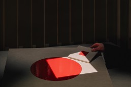
Working hand in hand with this intimate, cosy atmosphere, the lighting further accentuates the feeling of serenity. Although bright and neutral in its day-to-day setting, ideal for those working within the space, the lighting can take a more theatrical slant for product demonstrations. A central focal point within the space, dubbed ‘the campfire’ features an island table lit by a theatrical lighting rig, where targeted pins of light give visitors the ability to view tiles under different lighting scenarios in a dramatic, yet remarkably effective fashion.
Maya Gribby, Designer at Artin Light, explains the thought process behind this striking design move: “Solus has a slogan, which is ‘Every Tile Tells a Story’, and this is what the campfire idea was created around – a place where you’re telling stories about the tiles, where they come from, the qualities of those places, and the lighting replicates this to enhance that storytelling.
“One of our main concepts was colour grading, and matching the lighting scenario to where the tiles would come from, but also where they are going to go. For instance, if an interior designer comes in, and knows that the tiles will be in a room that is lit at 3000K, they can change the lighting to see how the tile is going to look in that lighting condition. So, it becomes a useful tool for them to have, not just for the storytelling aspect.
“We wanted to be able to shift from a neutral, bright workspace to a super moody, theatrical, almost museum level of dramatic lighting. With the introduction of the campfire table, we looked at how we could combine functional and coloured light.
“When you go abroad, there are different tones of natural light depending on where you are, and Solus wanted to bring that into the concept. For example, if the tile is from Rome, they wanted to be able to replicate the feel of the lighting in Rome. We also talked about whether the light has to be a spotlight, or whether it could have the feel of a shaft of light coming down. Then you have the shadows that cut off the light, and as a result viewers are more tempted to interact, move their hands into the light, and play around with it, getting a feel for the tile and exploring it a bit more. It became very interactive.”
The interactivity and customisation in the lighting was a very important factor in the lighting design, not just for Artin Light, but also for the client, as a means of giving viewers a more accurate depiction of what the tiles may look like in the likely very different lighting scenarios of their homes.
Having a client that was on the same page as the design team is something that was of great benefit to the overall project.
Luke Artingstall, Director and Founder of Artin Light, adds: “It was a collaborative process throughout. We approached Solus with these ideas; we had the initial brief, and we paid reference to the experience we had previously had on their London showroom where everything got quite dramatic, and it was all about taking it down to this one spot.
“From our perspective, we took that and moved it into this new direction. That led onto these ideas talking about how light can feel in different locations. That allowed us to bring tunable white and colour into the mix – this is something that Solus liked because of work that we had done previously, and they wanted to have that capability of bringing that it in as well.
“It was a whole process of experimenting with light, and experimenting with this idea of the campfire. It was a good, collaborative process, and Sam from Solus was very passionate about it – he appreciates lighting, and talks about lighting as a material, understanding that it can have a dramatic impact on everything.”
To create the striking lighting effects, Artin Light used two sets of framing projectors from AlphaLED – one in tunable white, and the other in RGBW. Beyond the Campfire table, the site includes a lower shared working space for the Solus team. All five programmatic entities within the space – the entry path, the bar, the front display, the campfire, and the workspace – are lit differently but unobtrusively, so that the transition between the areas is subtle, yet deliberate.
With such variation within the space, effective lighting control was imperative. Artin Light worked with Mode Lighting on the controls, to ensure that each scene had the right ambience and theatricality.
Artingstall continued: “We went through and set up a multitude of variations, including tunable white and coloured options, which we preset for Solus to use. We wanted it to be quite experiential so that once they got to the ‘Campfire’ table, everything was dark around them, they can use these controls to fade the light up and down.
“Although it’s not a huge scheme, it has been really successful. Although it wasn’t always straightforward to get to the end point, the result is really good, and I’ve not seen many scenarios like that before, especially in Manchester, that bring this kind of theatricality to a space like this.”
Stuart Alexander, Associate at Artin Light, adds: “The client really said ‘I’ve never seen anything like this’. It sounds like a joke to say that architects and designers and other people in these industries don’t actually know what 2400-6000K is. But it’s really cool that we could bring that to them and give them the knowledge and information. Now, they can talk about it and have the understanding to use warmer colour temperatures when they want to.
“Seeing from the imagery that Solus is posting on social media, it feels like it has given them a real image too – it has created an atmosphere, and a feeling of warmth and invitingness.”
“I went to a networking event there recently, and they had set a square spotlight onto each tile – these were lined up exactly with the three square tiles on the table, and when people were arriving to the event, it had the drama and theatrics of these glowing tiles on the table that instantly got people talking,” Gribby adds.
Despite the project sitting inside a Grade-II* listed building, the lighting designers said that the heritage aspect of the Manchester Law Library didn’t have too much of an impact on the interior lighting design. Instead, the restrictions that they did encounter were utilised to further enhance the intimate ambience.
“The building is absolutely stunning – it’s a little gem down this back street, and we couldn’t ask for a better building. For the interiors, before Solus moved in, it was used as an office and a showroom, so there weren’t any major restrictions. We couldn’t recess lights into the existing ceilings – everything had to be suspended in with minimal intervention,” Artingstall explains.
“The Campfire has an acoustic system suspended above it, which added to the whole idea of sucking viewers in. We had coordinated the gobo projection within that ceiling panel as well – this was all independent from the structure of the building. A lot of what the interior designers did was quite modular – it was more about the joinery elements that they brought into the space. They weren’t necessarily doing anything structural; it was a blank canvas that they then started inserting the joinery pieces into.”
Although the lighting concept has a large focus on the dramatic elements of the showcase Campfire, the team also took great care to ensure that, outside of the theatrics, the space still worked as a functional, comfortable workspace for Solus employees.
Artingstall continues: “From a functional perspective, although a lot of the focus has been on the theatrical elements, we also worked a lot on the day-to-day usage of the space. Away from the Campfire, towards the rear of the building, they’ve got access to a lot of natural light through a wall of floor-to-ceiling windows. These have blackout curtains, so that when they do bring people into the space, they can control the environment and the light in there.
“From a control system perspective, we also worked with Mode Lighting on multiple scenes, where it starts off as a day-to-day operation, but then it allows them to step it down to the point that it’s all focused on that one point.”
Gribby adds: “We added task lighting to the workspaces too, so even if they do have someone going through the dramatics of the presentation while others are working, it doesn’t take away from it by having these task lights on still.”
This combination of lighting elements adds to the overall aesthetic of the site, and indeed the reaction to the space, and in particular its dramatic lighting, since its opening, is something that Artin Light as a team, is incredibly proud of.
Alexander says: “Something that is very cool about it is that it has invited people to take pictures for their socials – there is a framework built in so that any architect or designer visiting the space can create their own little theatre. When we were there, we were playing with the tiles under the light for ages, it’s quite a powerful thing. To see that Solus has incorporated it into their branding, matching the design of their brochures to the shapes, having been inspired by what we’ve done, is really cool.”
“There’s something very emotional about light, and it’s clear from a lot of Solus’ marketing material, where it is used in such a dominant way, because as soon as you see it, you’re instantly drawn to it,” Artingstall adds.
“Looking at what we achieved under what was a fairly small budget is quite incredible. Ultimately, the clients are interior designers and architects, and traditionally they would go to a space where they’ll have a look at the tiles in a standard environment. But by taking this next level of approach, it has created a different vibe and elevated it into a complete experience.”


