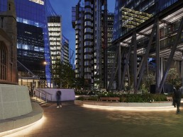
St. Helen’s Square & London Wall Place, UK
As the world’s cities continue to get bigger, it becomes increasingly important that these ever-expanding urban metropolises make room for green spaces, to connect city dwellers to nature in a way that is not always possible in such built up areas.
In the City of London, StudioFractal has collaborated with a couple of landscape architects to illuminate two such spaces: St. Helen’s Square and London Wall Place.
Nestled deep in the heart of London’s primary financial district, St. Helen’s Square operates as a major thoroughfare amidst the iconic architecture of 30 St. Mary’s Axe (more commonly known as The Gherkin) and the Lloyds Building, in juxtaposition with the Leadenhall Market entrance.
StudioFractal collaborated with competition-winning architects Gillespies to transform the formerly lacklustre public space into an atmospheric meeting point for busy city dwellers and visitors alike.
Through meticulously crafted lighting, StudioFractal has enhanced the architects’ exquisitely formed urban design, with its sinuous curving stone seating and pocket zones of park-like comfort.
“We wanted the lighting design to support the landscape design in encouraging pedestrians to dwell and spend time in the space,” said Chris Sutherland, Design Director at StudioFractal and lighting designer for St. Helen’s Square.
“The focus was on how the lighting could enhance the idea of useable green space and celebrate the planting via lighting. Therefore we looked at ways the lighting and planting could work quietly and subtly with each other.”
StudioFractal developed various options of low-level lighting and plant lighting, keeping the focus at pedestrian level to create a soft, peaceful ambiance.
Providing much of the ambient lighting across this 3,325m open space – the third largest in London – are three tapered steel columns, each housing a set of We-ef theatrical gobo luminaires. Here, light projectors cast leaf-like patterns onto the stone paving, softening the hard landscape with hints of nature in dappled light. The tallest column, provided by Urban Street Design stands at eighteen metres in height, embellished with a spiralling finish, marking the historical presence of a medieval maypole that once stood in its place.
The final element came in Light Projects bespoke ‘reeds’ within the planting, which feature an illuminated, glowing tip. These reeds are intended to bring a feel of magic at a human level, filling the area with an elegant playfulness. Developed to be as organic as possible, the reeds move and sway in the breeze.
Designed to add character and ambience to the space, the new lighting scheme creates minimal impact on the daytime scheme, with low energy, integrated LED luminaires from LED Linear and Kemps Lighting, secreted from view, offering longevity and minimal long-term maintenance.
Similarly with London Wall Place, StudioFractal worked to create a “change of pace” for workers in its surrounding buildings and for those passing through. A new destination in the City of London district of the capital, London Wall Place offers an acre of landscaped public realm set between two statement office buildings. Designed by MAKE Architects, the site responds to a client brief that called for a design that referenced the historic setting, extensive amenities and pedestrian links to the existing neighbourhood by reinstating its historic grids, knitting together two existing heritage structures – the remains of St. Alphage Church and a section of the original London Wall – with new pedestrian routes and a series of beautifully landscaped gardens.
Uniting the new development is a unique cladding – an iridescent coating of concrete and faience that reinterprets the knapped flint of the site’s Roman and Saxon remains.
In lighting this new space, StudioFractal was asked to complement and enhance the striking architectural forms and materials, and to bring to life this acre of public realm.
“London Wall Road is a very busy vehicular route surrounded by tall office buildings, and we wanted to create an intimate feel, similar in ambience to a residential garden,” said Ian Payne, Design Director at StudioFractal and designer of London Wall Place.
“So, you come in from a fast paced commercial environment, and as you enter the gardens you immediately slow down. The look and feel establishes a more relaxed ambience, drawing your mind away from the inner-city hustle and bustle.”
To create this serene environment amid the hectic city surroundings, a detailed lighting strategy was developed that connected commercial lobbies, gardens and the High Walk, enhancing views through the project and ensuring veiling reflections in the glazing were avoided so that the interior and exterior spaces were connected.
A layered lighting design utilising direct and reflected lighting creates a softly undulating visual environment, making use of light, shadow, reflection and projection to complement and enhance the material palette of stone, metal, water and planting, and to encourage exploration.
A key element of the lighting brief, Payne explained, was to create a “sense of theatre and recognisable character” throughout the space. “To achieve a unique ambience, a key approach for public realm lighting is the integration of the senses,” he said.
“Garden elements of water, planting, texture, movement and sound are all carefully orchestrated to build a subtly complex experience, one that has a true connection with nature and explores how we interact with it.”
Lighting was also used to bed the two commercial buildings within the landscape, something that is particularly evident with one building, where the landscape and architecture overlap. “The lighting integrated within the colonnade was about expressing the point at which architecture meets landscape,” said Payne. “And where water is integrated within the scheme, we have placed lighting to create reflections up onto the building and soffit, once again blending the boundary between the architecture and the landscape.”
A hierarchy of concealed light sources were developed and positioned within the architectural detailing, drawing the eye between historic and contemporary forms and materials while embodying the landscaped gardens with a sense of contemplative serenity.
High-level wallwashing integrated within the building form creates a backdrop to the new structures and materials, drawing the eye across the project and into the interiors. High-level We-ef FLC 200 spotlights provide subtle illumination to planting, project gobos onto the walkway below and illuminate the gently moving water feature.
Elsewhere, warmer, low level lighting directs pockets of brightness across the historic stonework, contemporary core-ten metal, GRC building columns and across the low level planting and walkways.
Care has been taken to avoid glare and present illuminated surfaces against silhouetted forms, creating a playful and atmospheric series of spaces, as Payne elaborated: “We had several workshops in which we discussed the materiality of the scheme with the architects, exploring how each element of their design would interact with light.
“For example, with the dark ceramic, it was not about washing it with light, it was about lighting the surfaces surrounding it, creating reflections to activate the material.”
Reflections of moving water activate sections of the soffit, adding a sense of tranquillity, while bespoke, linear LED fittings from Kemps Lighting integrated within the high walk extend the rhythm of light and shadow.
One of the biggest challenges in lighting London Wall Place, according to Payne, was to create a scheme that felt natural and a part of its wider environment. “The overriding challenge for us throughout was how to express light and not the light fittings,” he said. “Along with the design team, we were determined to create an environment that felt as natural as possible, subtly blending the multi-layered scheme.
“The architectural ceramic material posed a specific challenge when it came to integration and hiding equipment. The design had to be established very early on, due to the prefabricated cladding that was brought to the site with holes already predrilled – this required a lot of forward planning and precision.”
The notion of creating an relaxed, calm, ambient space in the middle of one of the largest cities in Europe also proved tricky for StudioFractal, as Payne explained: “Where the public realm meets the adjoining highways, our challenge was one of contrast: the bright, uniformly lit roads, designed to the City of London requirements, against the undulating illumination of the public realm, and our challenge was to create a smooth transition between the two.
“Our solution was carefully positioned dual purpose fittings. So for example, when lighting the road, we positioned iGuzzini’s Wow fixtures upon the building, for functional road lighting but also to wash light onto the green walls and planting below. In doing so, it integrated this natural language of the scheme throughout its boundaries.”
For both St. Helen’s Square and London Wall Place, StudioFractal looked to bring an element of theatricality. With St. Helen’s Square, StudioFractal wanted to create a more playful approach to the lighting, using gobos and illuminated reeds within the planter beds, while London Wall Place was more about subtly revealing the texture within landscape and “enhancing the character of the overall development at night”.
“Both projects have a similar purpose in creating a Green City zone for people to use, to provide a green immersive environment, not just a walkthrough but somewhere to sit and dwell; offering a break from the hard-landscaped environment that surrounds it,” Payne said.
“Both are great at achieving this, and apply similar principles of playfulness, exploring narratives around nature, balancing light and shadow, and in particular using patterned light to create visual differences between spaces.”
Following the success of both St. Helen’s Square and London Wall Place, StudioFractal is currently working on St Alphage Garden, a thin strip of public realm adjacent to London Wall Place, with the intention of connecting it to the rest of the scheme.
Although creating a tranquil environment for rest and relaxation in the midst of the hectic surrounds of the City of London sounds like an impossible task, Payne and Sutherland believe that they have achieved exactly what they set out to, offering up a relaxed space for passers-by to sit and dwell. “As you walk around the gardens, you do get this sense of calm, and even though you have the traffic noise in the background, you cannot help but be inspired by a feeling of tranquillity,” Payne said.
“As the planting grows, this will offer new views and different things to discover – through exploring the sites’ new interplay with light and nature.”


