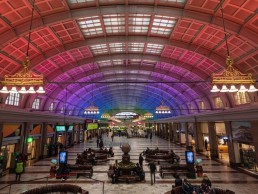
Stockholm Central Station, Sweden
For the newly designed lighting of Stockholm’s Central Station, Light Bureau sought to pay tribute to the site’s landmark status, while bringing the grand hall back to life.
With more than 200,000 visitors passing through each day, Stockholm Central Station is one of the busiest transport hubs in Sweden. Listed as a “building of national interest” – the highest grade of listing in the country – the station has been one of the first things that travellers into the city see for the past century.
While the station was first inaugurated in 1871, its grand central hall was first opened in 1927. It has since undergone a number of renovations and updates as its functions have grown and changed. Most recently the station has had a revamp of its lighting scheme, courtesy of Light Bureau, which was tasked with creating a new design that would balance respect for the original architecture with the commercial requirements of the space, and the needs of the passengers passing through.
Light Bureau won the lighting of this landmark project with proposal that Kai Piippo, Head of Design, described as “classic architectural lighting design”.
“There are only three light characters – general lighting, uplighting and accent lighting – so it’s a very simple concept, but it took us five years to complete because a lot of what seems simple at first is not, it took a lot of testing and a lot of hard work,” he explained.
Once the team had won the competition for the relighting, the assignment for the project began with extensive surveys of visual conditions, historical lighting and building appearance, analysing the existing lighting installations within the grand hall and the current functions of the space. During these studies, it was determined that the existing lighting was far below the requirements of the space, with levels as low as 65lx at night, with very little contrast or accent lighting.
However, one of the original features of the hall is a series of ornate, golden lamps called “Luzette”, that are suspended below the arched ceiling. As part of the renewed lighting, Piippo wanted to bring these beautiful pieces back to life, to reinvigorate the accent lighting within the space.
“When the station was first constructed, there were these beautiful lamps that were designed by the architect who built the hall in the 1920s. They had incandescent light sources in them, and after dark they were the only electrical light sources in the station. During the day there was daylight coming in from above and from the side, and then these beautiful, golden luminaires,” he said.
“In the 1950s, fluorescents came in, so they took the light sources away from the Luzette and went with fluorescent lighting along the side of the hall. In the 1990s, they were reconstructed by two lighting designers who redeveloped them and restored them, but they installed compact fluorescents in them, so you couldn’t see the golden upper part of the luminaire at all.
“We wanted to do something special with them, and we came up with an idea when we saw a low sunrise coming in, shining on the lanterns so that they really glowed. It was a wonderful, perfect light character. So we did a lot of light tests, and integrated some linear LEDs pointing upwards, finished in gold, so that they blended into the fixtures and brought them back to life.”
To improve the general lighting of the space – what Piippo referred to as the first “light character”, new ambient lighting was installed along both sides of the station’s central skylight. The aim was to reduce visual and physical disturbance on the ceiling by using small fixtures with a sharp cut-off. A combination of medium and narrow beam luminaires with DALI control allows for more varied contrast and light distribution, as well as the ability to highlight the station hall’s three event areas.
The second “light character”, the uplighting of the vast, arched ceiling, was intended to, in Piippo’s words, “create a hug of light”. “We wanted the ceiling to hug the people, and show the glory of its construction,” he said.
The uplighting incorporates DMX-controlled linear RGB fixtures and white fixtures in warm and cool white, mounted discreetly to the edge of the building to dramatically light up the spectacular ceilings. The introduction of coloured lighting allowed for the installation to be programmed with everyday static or slowly dynamic scenes, with additional, eye-catching displays for special occasions.
“I wanted to add a little bit more to the space,” Piippo explained. “I wanted the station to not only be a beautiful space. On a normal day, 200,000 people go through here, it’s the busiest place in Stockholm. The first time people come here, this is what they are greeted with.
“I thought about ways that we could use the light within the space to manifest the message of ‘Welcome to Stockholm – the capital of Sweden’. So we proposed to the company who owns the space that they could use the station to highlight occasions such as Christmas, Swedish National Day, Easter, and so on.
“One of the biggest things for me is to create a sense of value for the client, so that they know they are getting a good investment. We had 10 different scenarios programmed in that they can choose from, and then if there is anything – an event, etc – we can help them to create whatever they want with the system. We wanted to give them a system that is rich, that gives them something more.”
Throughout the project, Piippo, Project Leading Lighting Designer Karolina Hahn, Senior Lighting Designer Andreas Ejhed and Technical System Specialist Fredrik Winqvist worked in very close cooperation with the project leaders to create a solution that would showcase the splendour of the site while creating a warm and inviting space for travellers passing through. The team also made extra efforts to speak to the people that would be using the space the most, to give them what they want.
“One of the first people that we met was the maintenance manager of the station,” Piippo said. “He has been working there for 20 years or so, and he knows everything about the site. We interviewed him and asked him about what we should do and should not do. He said it needs to be easy to control, easy to access the controls, so we took this into consideration as he is someone that will actually live and work with the lighting. This is a key part of my design process – you need to have the knowledge about the daily use.”
This attention to detail has led to the creation of a new lighting scheme that fills the space with light in a considered, subtle way. Showcasing the architecture and creating a welcoming, inviting space for those using the space – with light levels now measuring up to 700lx, ten times what was previously there. With Stockholm’s varied light levels throughout the year, the new scheme also has an improved daylight control system for the general lighting, meaning that in the summer months where daylight is more abundant, the general lighting dims down, saving energy in the process.
“It’s very good to have,” Piippo added. “With everything going on at the moment, it’s not a ‘nice to have’ to think about the environment, it’s a ‘need to have’. It’s a key issue to use as little energy as possible.”
Looking back on the project now, Piippo explained that, with the Central Station having the status that it does within the city of Stockholm, he couldn’t help but feel the pressure to get the new lighting scheme right. However, his experience of working within heritage buildings means that he was able to find a solution that would work.
“You do the Central Station in Stockholm once in your lifetime, and you put that pressure on yourself,” he said. “But because of this project, and several others, I have become a specialist in historical projects. It’s super interesting to understand the process and the pros and cons of how to make it a successful project. There are a lot of different things to take into consideration, but it’s interesting.
“Going into the station now, it’s a simple lighting design, but it’s a beautiful space to be in; it’s inviting and welcoming. I’m very happy and proud to go there. The building managers are using the different scenarios, and you see it a lot on Instagram, etc.
“Before, it was dark and dull and boring, but now it is a beautiful space, it has come alive again.”


