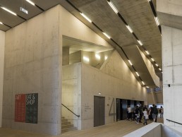
Tate Modern Switch House, UK
Following on from its previous design for the original musuem in 2000, Arup’s considered lighting scheme ensures that, while the Switch House’s multitude of spaces express a variety of forms and functions, the old and new parts of the Tate Modern are still perceived as one collective organism.
Tate Modern has changed London since it opened. The impact it has had on urban design and the development of the South Bank and Southwark, has been as substantial as its influence on the city’s artistic, cultural and social life. It was not long after the opening of the Tate Modern in 2000, for which Arup designed the lighting, that thoughts turned to expansion of the museum. Unoccupied parts of the iconic Bankside Power Station were considered as new spaces so Tate made plans to augment the building further. Retaining the original Tate Modern architects, Herzog & de Meuron, for the extension, Tate felt that Arup’s experience working with the architect, lighting the original building, would be of benefit to the new project and thus appointed them to develop all lighting design for the extension – daylight, interior and exterior lighting.
The new Switch House extension provides 60% more space and includes a wide variety of learning, outreach and social spaces for visitors, as well as new office space for Tate staff. The project comprised various parts: integration with the original Tate Modern via the Turbine Hall space; building the new gallery spaces within the existing ‘Switch House’, to the south of the Turbine Hall; converting the underground former oil tanks into exhibition spaces; and the new ten-storey tower above these, housing the learning, social and office space.
The client wanted to ensure that, while these different elements of the building are expressed, the old and new parts are still perceived as one Tate Modern. Therefore, a key challenge for the internal lighting design was to develop a scheme that integrated with and accentuated the architecture of the new spaces, whilst maintaining a consistency with the existing building. The other challenge that Arup was set was to ensure that the building used 20% less energy than a typical museum, and would attain industry recognition for sustainability in the form of a BREEAM ‘Very Good’ rating. The lighting clearly plays a key role in achieving this goal.
For the new extension, Herzog & de Meuron developed a ten-storey tower with a pyramidal form generated from the combined geometries of the site context and the existing building. While the original Tate Modern is largely horizontal in orientation, the tower creates a vertical orientation, with a generous public circulation route that rises through the building.
Reacting to this context and to the client requirements, the lighting scheme for the public concourse and circulation areas comprises mainly bare fluorescent lamps slotting between precast concrete panels. These both complement the form of the space and are orientated to help draw people through the vertical building towards the galleries and other public areas. Linear fluorescent lighting is an energy efficient light source that fits the architecture and references similar lighting in the original building to continue the consistency.
This lighting is closely integrated with the structure and other services, minimising visual clutter and creating a scheme that is a considered part of the fabric rather than an afterthought. The lighting is mounted onto cable trunking installed between precast concrete ceiling panels, in a slot shared with sensors, smoke detectors, loudspeakers, sprinklers and CCTV.
This integrated approach is used in all public spaces of the new building, which is largely characterised by exposed concrete structure. The concourse lighting scheme is adapted in each of the adjacent functional spaces in the tower, which all have similar exposed precast concrete ceilings.
Arup’s approach takes into account the lighting requirements for the wide variety of social and educational areas for patrons, whilst providing a consistent feel.
The learning spaces on Levels 5 and 6 are bathed with generous ambient light, using a similar system of linear fluorescent lighting, for maximum flexibility of use for these areas. The office spaces on the south side of Levels 3, 4, 5 and 6 use a tubular luminaire, selected to look similar to the bare fluorescent tubes whilst providing glare control for the working environment. LED cast-glass pendants, suspended from the same trunking between the pre-cast concrete panels, add character and sparkle to the dining areas – the Level 8 Members’ Room and Level 9 Restaurant – without distracting from their spectacular views over London.
Glass pendants are also utilised in the Bar on Level 1, hinting at the dining spaces above with the same lighting and mirroring the Café at ground level in the existing Tate Modern, which also gains its character from distinctive pendant lighting.
The Switch House includes a variety of new and diverse gallery spaces. The galleries on Level 3 are more intimate spaces than the others, with a lower ceiling height. The lighting of these galleries is also more intimate, using track and spotlights only to focus light on the walls and artworks. The lighting track is located between the beams in the ribbed ceilings. Spotlights mount into this track on an elongated stem designed to avoid ‘hot spots’ on the sides of the beams, whilst minimising visual clutter by having the spotlights partially concealed by the beams.
The larger galleries on Levels 2 and 4 are both provided with homogenous ambient light, as well as track and spotlights for flexibility. High colour rendering linear fluorescent lighting is mounted on suspended lighting track on Level 2. This track follows the rhythm of the structural grid of the building, and forms a visual datum beneath the exposed ductwork and other services above.
Uniform backlit ceilings give a calmer feel to the large gallery spaces on Level 4. These connect the new galleries stylistically to existing ones, accessible via a nearby bridge over the Turbine Hall. The amount and colour of light in these spaces is selected to enhance each exhibition, whilst meeting strict conservation and display standards.
Half of the Level 4 gallery space also allows generous but controlled levels of daylight through a system of skylights above the diffuse ceiling. Direct sunlight is blocked by a grid of ‘egg-crate’ louvers on the roof, above the skylight glazing, designed to block the sun at all times whilst optimising the amount of daylight that can pass through the sky vault. The incoming daylight is diffused by both the skylight glazing and the stretched fabric ceiling to the gallery space, to create a comfortable art viewing environment. Daylight levels in the gallery have been optimised through this skylight design, to ensure that the levels are within an acceptable range for gallery conservation standards for most types of exhibition.
The other new gallery and public spaces are the converted Oil Tanks and adjacent spaces on Level 0, under the new tower. These spaces, initially temporarily opened in 2012, are architecturally treated as raw, ‘as-found’ spaces – there was minimal intervention to bring the internal environment to an appropriate standard, leaving the form and finishes as they were as much as possible.
The Level 0 lobby space is a juxtaposition between the existing concrete structure and the new foundations for the tower, which cuts through. The space is unified by a grid of simple, suspended trunking, carrying track and bare linear fluorescent lamps, creating a consistent datum with simpler lighting and an industrial feel. The adjacent Transformer Galleries, space that used to house a transformer, have a similar raw form, and simple suspended lighting track allows appropriate display lighting with a minimal intervention, barely visible above the artworks, which are the real focus of these spaces. The two Oil Tanks – the east tank devoted to media art, and south tank for performance art and events – each have similarly minimal interventions for lighting. Small lengths of surface-mounted lighting track are strategically dotted around the soffit of the east Tank, in a layout coordinated with the other required ceiling services. The south tank is illuminated by lights hung from a suspended theatrical scaffold-bar grid.
The LED spotlights used in all gallery spaces emit light barely distinguishable in quality and appearance from traditional halogen lighting. 42W Xicato Artist Series LED spotlights, manufactured by DAL, were used, more than halving the gallery’s typical energy demand from halogen spotlights. The final specification of the spotlights was left late in the construction programme – to ensure that the most up-to-date technology could be used. This careful specification of LED spotlights is a significant contributor to minimising the energy use overall.
The lighting control system also plays a significant role in minimising energy use. Daylight filters through the perforated brick façade and clear façade glazing throughout the new building, and the distribution of daylight was carefully analysed, assisting in developing the electric lighting scheme. Daylight- and/or occupancy-linked lighting control is extensively employed, ensuring that only as much light as required is used where and when it is needed.
Arup also designed the external lighting for the landscape to the south and west of the building. From the beginning, the strategy for this was ‘less is more’ to keep energy use low, and to provide only as much lighting as required on the routes where it is needed. The approach is kept deliberately simple and uncluttered, using mainly multi-head lighting columns (mostly six-metres in height) with projectors positioned and aimed to direct light precisely, creating a comfortable environment that minimises light pollution and considers ecological requirements. The use of shorter columns in an irregular layout is a nod to the taller, regimented columns on the river-facing north side of the building, but also simultaneously creates a lower level scheme with a more ‘local’ feel.
For the night-time view of the façade of the new tower, Arup carried out a number of design studies, testing various options. This led to a strategic decision being made to not add more feature illumination to the building façade. Consistent with the existing Tate Modern, the only lighting accentuating the building form is the expression of the carefully designed internal lighting, glowing through the façades. This approach links the function and activity of the interior with the appearance on the skyline of the exterior, and helps to integrate the old and new parts of the building. This also makes a visual statement on sustainability; no superfluous lighting was needed on this new landmark building.
In addition to areas discussed, UXUS was tasked with developing the design for the Tate’s new shop. Launched in June last year, the store is housed at the base of the gallery’s distinctive pyramid extension. The store is conceived by UXUS as occupying the crossroads of culture and commerce by inviting visitors to explore the world of art through the museum’s retail expression. Part shopping destination, part cultural hangout, it is designed as a ‘permanently temporary’ space with the flexibility to respond to the gallery’s fast-changing exhibition and project schedule.
A bespoke system of stackable furniture modules allows for regular reconfiguration to keep the displays fresh and exciting for visitors, as well as accommodating seating for browsing and events such as book readings and talks.
Following with the permanently temporary theme, the lighting is provided through a flexible track system, allowing for the store to be reorganised as often as necessary.
‘‘We have integrated LED lighting in the jewellery case area, mid floor shelving units, and within the postcard wall to highlight products,” explained Oliver Michell, Chief Creative Officer, Architect and Co-founder of UXUS.
Additionally, Herzog & de Meuron designed bespoke pendant lights that punctuate the jewellery and reading areas. These lamps are also featured in the adjacent ground floor café, creating a visual link between the two spaces.
At high level, there is a series of light boxes running along the perimeter of the shop to display graphics. The graphics are intended to change regularly, and will affect the overall look of the store from season to season.
Shop windows also have dedicated lighting, both at floor level and overhead in tracks embedded into façade beams, to showcase visual merchandising.
FLOS UT track spot luminaires were used, with 29.3w Xicato XTM 3,000k modules and a DALI dimming driver, utilising 16º, 22º, and 32º optics. This fitting has been developed with a deep set LED to help minimise the glare and discomfort whilst allowing for complete control of the light within its environment. The selection of the optics were based on creating layers of light to the point of sale whilst trying to avoid direct light onto the circulation space to help define product in application.
The store was commissioned to help direct the light in the right orientation and to prevent as much glare as possible from being visible to the customer.
One thing that is apparent for both the Tate Modern and its Switch House extension is consistency. From Herzog & de Meuron’s skill in combining elements of old and new to Arup’s strategic and considerate scheme, which fit seamlessly into the London landmark’s many spaces. Using lighting as vehicle for such design, the Switch House is an extension that combines with the original to form a single organism.
Pic: Gavriil Papadiotis


