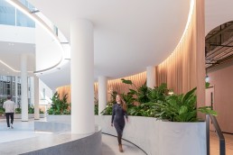
The Ark, UK
One of the most iconic buildings in London’s Hammersmith borough, The Ark has recently undergone a refurbishment, spearheaded by architects at Gensler.
The intent behind the redevelopment was to bring a fresh contemporary feel to working spaces, giving it a hospitality feeling.
Central to this approach was the lighting design, created by Lichtvision Design. After being approached by project manager Gardiner & Theobald, Lichtvision worked with the architects to develop a lighting strategy that would complement the wider architectural concept.
Laura Cizauskaite, Senior Associate and Project Lead at Lichtvision Design, explains how the original design brief shaped the lighting scheme: “Gensler’s design narrative explored the journey, theatre, and compress/decompress concepts. We took those concepts on board, engaged with the building’s history, and how those storylines can be addressed with the lighting.
“For the journey theme, we looked at the location – the building is set back a couple of minutes away from Hammersmith train station, surrounded by train lines and the Hammersmith flyover. The entrance is also set back, surrounded by a courtyard. As you come in, the main reception is located centrally to the core area. Naturally, a ribbon-journey theme developed, helping to invite and lead people into the building and the reception. The oval façade structure was followed with the curvature used in the interior spaces to guide people in, and the use of concealed lighting helped to achieve that.”
The compression/decompression theme, Cizauskaite continues, was led by the building’s varied interior heights – shallow ceilings in the entrance, lift lobbies, and café area contrast with the double height reception space and two eight-storey height atria with lightwells. The lighting therefore aimed to balance the contrast between the suppressed and heightened areas, creating continuity and harmony.
The theatrical element plays on the building’s history and standing within the area, while also capitalising on the current trends of workplace design, incorporating F&B and hospitality facilities. Both the building’s entrance, and its rooftop “Crow’s Nest” VIP area has a strong expressed geometry which we wanted to highlight giving it a “graphical” approach, as Cizauskaite adds: “We framed the entrance, atria windows, and geometrically shaped Crow’s Nest with colour changing, edge-lit lighting.
“We aspired for The Ark to be a landmark in the Hammersmith area, much like the Oxo Tower – visible from far distances at night.”
Across the site, therefore, Lichtvision Design merged the various themes and concepts – the fluidity and curvature of the façade and architectural shapes resemble the journey experience, compression and the graphic approach.
Cizauskaite continues: “To tell a story of a journey, we integrated linear lighting to both the exterior and the interior, leading the visitors right into the reception. The decompression theme was resolved by balancing natural daylight and artificial lighting, giving it a light and airy atmosphere. The graphic approach was applied where architecture had sharp and strong geometry – the entrance frame, lightwell windows, the Crow’s Nest’s geometrically shaped perimeter with ceiling lines.”
With a lighting concept that is so engrained in the architectural approach, Lichtvision Design worked in close collaboration with Gensler throughout the project; at the concept design stage, the lighting designers and architects held multiple workshops with the client and the heritage consultant to ensure that lighting is respecting the historic nature of the building and complements the interiors.
“For example, only the entrance courtyard had been refurbished, with the rest of the exterior lighting due to remain. Hence, we maintained the existing original bollard perimeter lighting, allowing for redistribution and refurbishment to them,” Cizauskaite adds. “The colour temperature of the fixtures was changed from 4000K to 3000K with dimmable LED modules, connected to a lighting control system for optimum operation.”
Inside, the collaborative approach was particularly essential, in no small part because of the abundant daylight on offer. Marrying this natural light with an effective artificial lighting scheme was one of the core set-out goals for the project.
Cizauskaite explains: “At the start of the project, we completed a survey to analyse the light levels from the natural daylight coming through the glazed façade, the lightwells, and the existing artificial lighting levels. The light levels were very varied as you navigate through the space – a very bright daylit entrance foyer, while moving into a double-height reception area was left with very little daylight. Two lightwell atriums eight storeys high contributed some daylight, but due to their different sizes, the light levels were also inconsistent.
“Our aim was to balance the inconsistency of daylight and artificial lighting in order to create more uniform, balanced spaces. An increased level of artificial lighting was used in the reception to allow for a smooth transition from the naturally very bright entrance.”
A good amount of artificial light had to be integrated into the daylit entrance as well, to ensure the bright ambience is not affected in the evenings and wintertime. The building operates standard office hours, with café facilities closed in the evening, whilst allowing 24-hour access nighttime security. To that end, Lichtvision Design designed lighting controls with circadian rhythms in mind; communal spaces that are bright and energising during the day and softly reducing the light levels in the evening and nighttime.
Alongside the circadian considerations, the lighting scheme also plays up to the more “hospitality-oriented” office space feel. A recurring trend in modern workspaces, The Ark has been designed to be a welcoming and invigorating space. Cizauskaite explains the benefits that such a design can bring, and how the lighting design contributes to the hospitality feel: “There is a lot of research on how the environment affects our mood and productivity, and how colour of lighting, biophilia, and art can influence and stimulate it.
“As post-Covid employers are still trying to get staff back into the office, it needs to be a more appealing and exciting place to come back to. Also, with hybrid working days, the office became not only a space to work, but also a place for
social gatherings, meetings, and connecting with colleagues. Taking a hospitality approach to the workspace helps it to be a more enjoyable, welcoming, and exciting place to attend.
“In the design of the space, the hospitality approach included complementing the biophilic design features, such as lush greenery, rich wood finishes, etc. The café features a signature bar, and the use of decorative focal lighting to the main reception and staircase. Integrated low-level lighting also helps to create a more human-scale, intimate atmosphere.”
“After careful consideration, we selected 3000K colour temperature throughout the communal spaces – we wanted to create a welcoming, fresh, and consistent atmosphere. It works well for general lighting and naturally appears warmer where wood finishes are used to give more of a hospitality feel.
“Prior to the refurbishment, a 4000K colour temperature was used for the general lighting, and during the initial site survey, we felt it looked too cold and uninviting – we wanted to soften it up while maintaining the workplace environment,” Cizauskaite adds.
While the project was part of a wider refurbishment of the building, Cizauskaite explains that, with detailed 3D modelling in place, any potential issues or challenges were easily bypassed, although there were several considerations that still had to be made.
“The project was delivered using 3D Revit BIM software, allowing good services coordination and ability to spot potential clashes,” she says. “Design had to consider accessibility for the future maintenance to the double-height spaces and atria. We ensured that atria window lighting can be accessed via individual floor levels, without the need for a cherry picker or scaffolding and that long-lifetime LED luminaires were used for the general lighting in the double height spaces.
“The biggest difficulty was to fully conceal some of the lighting when working with the existing structure. In those instances, a more exposed lighting approach was undertaken, complementing the graphic approach strategy which is designed to be used during the dark hours of the day or for special events as a feature lighting.”
With the goal of revitalising one of Hammersmith’s most iconic buildings and creating a location that blurs the boundaries between workspace and hospitality, Cizauskaite believes that she can look back on a job well done. She reflects: “Both the vision of the architecture and lighting approach were maintained from concept to completion; looking at the building today, we see our concepts visualised into the space and how it complements the refurbishment. We are happy to see that close team coordination throughout the design and construction stages allowed us to bring this vision to life.
“The lighting design successfully achieves our set out goals: to be an inviting and enjoyable workspace with its feature highlighted architecture being an iconic building in the area.”


