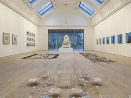
The Whitworth, UK
It’s won several RIBA awards this year including the National Award, the North West Award, the North West Conservation Award and the North West Building of the Year Award; was this year’s Art Fund Museum of the Year winner; and most recently co-commissioned and produced the Richter / Pärt project as part of this year’s Manchester International Festival… ‘It’, is one of Manchester’s most notable buildings and galleries… The Whitworth.
Making up part of the University of Manchester, the Whitworth was founded in 1889 as the first English gallery in a park. Originally designed by J.W. Beaumont, it is home to an internationally important collection of works on paper, wallpapers and textiles as well as a contemporary collection institution, acquiring works by emerging and established artists.
Having undergone various development stages over the past 126 years, the gallery is now an amalgamation of numerous alterations and reconfigurations, which often resulted in inappropriate, compromised and inefficient use of space. For example, in 1908, the external frontage was resolved, however the west end of the building presented an unresolved, blind mass to the park. Then in the 1970s, the original Grand Hall on the first floor was altered to contain collection storage as well as study and office space. More recently, with a growing national and international profile, an increasing audience, an ambitious exhibition and education programme, and a growing arts collection, the Whitworth found a new need to expand.
The gallery’s RIBA architectural competition, which was won by MUMA architects in 2009, wanted to make its internationally important collection accessible to a wider range of visitors; make better use of the existing gallery spaces; and establish a relationship with the surrounding grounds and park.
The brief included the following quote from previous Whitworth Director Margaret Pilkington following a visit to Oslo in 1932: “I have come to the conclusion that a good museum or gallery should be a place where people feel comfortable. If it stands in a garden or park, the visitors should be able to enjoy the beauty of the outdoors as a counterpart to what is within.”
This quote struck somewhat of a chord with MUMA and underpins the architectural firm’s design approach to the Whitworth, with new visual connections to the park created and celebrated. Equally important to the architectural firm was the opportunity to establish a new transparency. MUMA’s design aimed to respond to the existing characteristics of the site and building.
For MUMA’s Stuart McKnight, it wasn’t just the Whitworth’s wants and desires that were the main focus of the project, it was their vision also, as he explained: “We all wanted to better connect with the park as the competition brief had outlined and so we took both horizontal views of the park and opened up the original Victorian roof lights to bring in light from above.”
The new gallery extension encapsulates the unresolved west end, creating a new frontage to the park, while the architectural hierarchy and scale has been carefully considered to ensure that the clarity of the principal entrance is not undermined. McKnight spoke with mondo*arc about some of the improvements made through the project: “One of the issues with the existing building was that it was quite dark, only 16% of the ground floor galleries had daylight and we felt that had to change. Now, 56% of the ground floor galleries have daylight but there is also the café and promenade, so the majority of the ground floor has daylight streaming through it, as well as views connecting to the park.”
Working with the lighting group at BuroHappold Engineering and company Partner Stephen Jolly, two new wings of contrasting character extend into the park containing a garden courtyard and new entrance. Placed at main gallery level, the transparent, slender wing of the café and its south-facing terrace celebrate the park context and the avenue of trees. DAL Cool Ambience X100 recessed ceiling downlights with Xicato LED light engines feature in the café’s dining area, while pendants from Delta Light’s Ultra C range illuminate the server area. With its transparent linear form positioned above a sloping site, as the ground falls away, diners find themselves within the tree canopy of the park.
To the north, we find the more solid form of the Landscape Gallery, featuring Zumtobel’s ZE batten luminaires – overlapped by 100mm to ensure a continuous linear lighting effect and concealed in the Landscape Gallery lantern. The new study centre is also featured in the north wing extension and makes use of recessed downlights from DAL, surface mounted XAL Mino 60 fixtures, while louis poulsen AJ table lamps feature in the workspace. Both areas provide an urban edge as well as a visual and acoustic buffer that contains the garden.
New openings have been created in the existing building at significant locations, connecting the new extension and providing the heart of the building with a range of long views. A promenade gallery – lit by DAL Ambience 100 downlights using Xicato light engines – wraps the existing exhibition galleries and provides a vantage point to view the garden and park beyond. This glazed link maximises the visual connections to and from the park and connects the central exhibition gallery to the garden, meaning artwork inside and out can connect. Gallery lighting throughout the Whitworth sees ERCO track mounted LED gallery Lightboard spotlights used.
The promenade is repeated on the lower ground floor, turning the former windowless basement into a generous space that engages with the Art Garden, which comes alive at night with various Bega luminaires and creates a welcoming informal park entrance at the west of the Whitworth. The lower promenade is lit through Modular Lighting Nude Par 30 surface mounted downlights semi-recessed in the ceiling. As well as this, Bega LED surface mounted downlights with deep lamp recess for maximum glare control, are featured within the brick arch soffits and plastered arch soffits. The creation of this courtyard and promenade allows light and park views into the heart of the existing building.
MUMA’s strategy was to work with the inherent characteristics of the building and the high daylit volume of the Grand Hall has now been recovered as a place of gathering.
“We knew that as soon as light was brought in we would need to think about how to control it. We worked with Stephen and the lighting group at BuroHappold, who developed a system of daylight control that’s automated to work in tandem with the track mounted LED gallery spotlights. It was about maximising daylight but balancing artificial light to highlight the art… How did we do this without overexposing the pieces?”
As the sun moves around the building the louvres open and close on the roof lights – as the evening approaches and the daylight diminishes the artificial light recognises this and lifts light levels.
“We agreed with the Whitworth that a more dynamic approach to conservation of objects and lux exposure was needed and we agreed to year round lux hours for certain objects,” said McKnight. “This was very helpful because with our daylight control mechanisms the galleries can put themselves to sleep at night so that when the building closes, the louvres all close and the remaining quantities of daylight get cut out. As the lux exposure is cut out at night, the visitor hour lux level for an object can be lifted during the day.”
Stephen Jolly adds to this telling <strong>mondo*arc</strong>: “The brief was for a 21st Century gallery in the park to drive community engagement, so daylight and views were key – without creating glare, energy or conservation issues. We agreed with the client very early on that the exhibition galleries should be daylit and not black boxes. This allowed us to restore and reuse the original rooflights that had been covered up. Restoring the roof lights also restored character and dynamics to the daylighting of the galleries.
“We had to provide flexible space that could work at different light levels for exhibits with different sensitivities to light exposure. We agreed a series of different set points with the curatorial team that would form the basis of the user control interface: 50 lux, 100 lux, 500 lux, 1,000 lux and so on.
“Diffuse glass was used to provide the background daylight level moderated by internal louvres to achieve the different set points. The control system balances the amount of daylight and artificial light to achieve the overall agreed lux-hour exposure defined by each set point. At each design stage modelling and visualisations were carried out to confirm the design assumptions and communicate the brief back to the curatorial team.”
As a listed building there were naturally key considerations that had to be worked to during the project, including carefully positioned lighting tracks in the vaulted ceilings that would suit light angles but also the building’s fabric. Working within an existing building also predefined the amount of glazing in the roof lights and the source daylight level for each gallery. BuroHappold assisted with performance requirements for the glazing to provide the right amount of daylight, which could be moderated by the louvres as required.
Integrating new with old is something of a skill and at the Whitworth the two blend seamlessly – bringing new life to an out-of-date space. According to McKnight to make this work there are a lot of subtleties within the space – contrasting colour rendering for when looking at art and eating food, considered use of materials and careful consideration of how the old space flows through to new. As part of this, the lighting throughout the gallery has been carefully constructed. Bespoke LED wall scoops with hidden fixings from Mike Stoane Lighting are recessed into the internal stair treads, while Fagerhult Diva II surface mounted LED linear fixtures were concealed throughout the new Learning Studio, and in the Conservation Studio, Whitecroft Glide luminaires are fixed in the soffits.
“Similar materials repeat or reference themselves, while views out needed to work from one space to another,” McKnight noted. “As you move through the lighting, where the central gallery opens onto the west promenade there could have been the danger of optical strain as there is so much glass, however a delicate steel structure casts a shadow on the west elevation to help adjust the light level of the west promenade. The contrast isn’t too radical from inside to out – the equivalent of wearing a baseball cap or shading your eyes.
“The glass itself has solar controlled coatings,” continued McKnight. “Also built into the design of the west promenade are translucent blinds which help control a medium light level for the central gallery. You can still see through them but they cut the optical strain, unifying the two. We were thinking about the visitor experience in less tangible circumstances.”
Commenting further, Jolly adds: “Each lighting set up is an integral part of the exhibition design for each show. We have provided the gallery with a daylight and artificial lighting infrastructure that can be adapted to suit the exact requirements of each exhibition. The needs of the artwork come first but it is important to provide daylight for comfort. The circulation promenade that wraps the galleries provides views to outside without exposing the artwork to uncontrolled daylight.”
This reinvention of space by MUMA and the lighting group at BuroHappold Engineering has set the Whitworth on the right track to continue growing Manchester’s position as a cultural hub. Concluding, McKnight said: “The Whitworth has been described as a breath of fresh air and I think this is a reaction to light and the way we’ve changed the existing building. It feels light and airy due to the quality of light and views. These galleries have been made possible through an approach to controlled light and views.”


