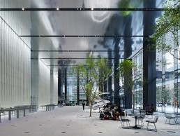
Toranomon Hills Business Tower, Japan
Following its success at the IALD Awards, arc speaks to Sirius Lighting Office about the Radiance Award winning lighting design of the Toranomon Hills Business Tower in Tokyo, Japan.
Located in the sleek, stylised, ever-growing metropolis of Tokyo, Japan, the IALD Radiance Award winning Toranomon Hills Business Tower features a lighting scheme to match its surroundings, while improving the wellbeing of building users.
Designed by Ingehoven Architects, the goal for Toranomon Hills Business Tower was to be a space that improved the motivations of businesspeople while functioning as a refreshing, revitalising space for visitors.
The entrance space for the tower is characterised by an 11-metre high mirrored ceiling, with towering white walls that coexist alongside trees, a waterfall and art objects. Lighting for the tower came from Sirius Lighting Office, which was tasked with creating something “innovative and sophisticated” with the scheme.
Hirohito Totsune, President of Sirius Lighting Office, explained: “The Toranomon Hills area is comprised of four towers – two are already complete, while two are still under construction. We had to consider skilfully harmonising the lighting design of the existing structures with the other ‘to be completed’ buildings.
“We also had to acknowledge that the Business Tower serves as an international hub for global business, as well as having fast and easy transportation access to the international airport. We were challenged with creating a design that would both respect and emphasise the beauty of the architectural atmosphere.”
As such, the lighting designers developed a concept that highlights the building’s beautiful architecture, and particularly in the entrance space, connects it to its surroundings. Totsune continued: “The entrance hall has the architectural concept of an ‘Extending Boundary Line’ that connects the interior and exterior spaces into one existing domain. We adopted this into our concept, with the first motive being to try and extend the outside lighting scape into the interior.
“The second was to use fixtures that could change colour temperature in order to match the exterior daylighting conditions. For example, the morning scene starts at a bright, cool colour temperature, then transitions to a slightly warmer colour temperature for the afternoon hours before finally reaching a deeper colour temperature at nighttime, altogether creating an unnoticeably seamless series of natural scenes.
“These two design elements work to seamlessly tie together the narrative of the concept, while fulfilling the additional motive of benefitting the mental health and comfort of the office workers throughout the entire day.”
The decision for the lighting to transition throughout the day, following the natural light cycle to create a scheme in tune with building users’ circadian rhythms was a conscious one, proposed by the lighting designers.
“The designer’s original image was a continuous, bright white atmosphere,” Totsune recalled. “We argued that this effect could bring an energetic atmosphere during the day, but could also have the potential risk of impacting on the workers’ relaxation at night. We considered a way that would promote a more natural, healthier work environment through our lighting design. An essential piece to this concept work was by acknowledging the natural daylight and considering how to extend it even further into the space as a whole.”
Within the entrance space, the vast walls are formed of white terracotta louvres with a glossy glaze; the lighting method here was carefully determined to eliminate glare while creating dimensionality and bringing out the texture. As such, narrow downlights mounted in slits on the ceiling illuminate the wall, with matting applied only to the front edges, The glossy finish is then lit by recessed floor lights on the side of the louvres, where the risk of glare was lower.
Totsune elaborated on the key architectural considerations within this space: “The white terracotta wall is the main symbol for the entrance lobby, we set this at the peak lux level for the space. In addition, the middle ground making up the entry lobby space had to fulfil the duty of accomplishing the architectural narrative of having a borderless connection. This was executed by utilising dimmable and tunable fixtures in order to seamlessly adjust to that of the exterior.
“Another key figure to the space is the vegetation: we had to consider what type of lighting this would need in order to effectively grow indoors. With the help of a professional botanist, we were able to hand pick fixtures with the appropriate amount of light, and at the correct spectrum to wholly provide the proper nutrients to the trees at a similar rate to that of natural sunlight.
“While fulfilling these objectives, we were able to maintain a clean ceiling atmosphere for the architecture by recessing all the fixtures in the already-created ceiling slots designed by the architect.”
Concerning the mirrored ceiling surface, Totsune explained that one of the main worries was “the potential for reflected glare to occur on the ceiling from the light source of inground, recessed fixtures along the terracotta wall”. “We solved this by using a densely pitched LED fixture including a specially built-in light seal, which was measured to the millimetre in order to cut off glare while keeping the same intended effect.
“We also realised that concentrating too much on reducing the glare could result in a risk of decreasing the lighting effect of the wall, therefore we tested repeatedly until we found the most ideal result to satisfy both ultimatums.
“On another note, being that the ceiling directly reflects the floor surface, we also considered how to beautifully light the ground surface in the entrance space in order to cast a beautiful reflection.”
With a number of different elements within the lobby space alone, from the vegetation to waterfalls, to sculptures and art pieces, there was a risk that designers at Sirius Lighting Office would need to over-illuminate the area to properly highlight each individual object. However, for Totsune, it was about looking at the overall picture, rather than the separate pieces.
He explained: “Out of all of these features, our question wasn’t primarily to ask what objects we should emphasise, but rather how all these elements could appear harmonised as one complete art piece.
“For the waterfall lighting, we visited the mock-up many times to understand how many fixtures we needed and at what pitch they needed to be placed in order to yield the most beautiful result.
“For the complex artwork, we used 3DCG to discover which angle, pitch, lux level and number of fixtures we needed in order to accomplish this effect. However, we were finally able to meet up with the artist herself to ask what her ideal lighting concept was, where we ended up using a DALI controlled system involving 30 fixtures, each with their own separate addresses and dimming levels to create a near zero shadow effect.”
Looking further up the building, the façade features rows of horizontal fins. At the lower levels, these are illuminated to guide people into the lobby, while higher up, LEDs embedded into their edges project slowly moving images, reminiscent of clouds seen in Japanese ink paintings. Designed to harmonise with the surrounding night view, the lighting on these fins is one of the first examples of exterior lighting in Tokyo to visualise the natural environment.
Totsune explained how the lighting for these fins fits into the wider architectural design: “In the overall composition of the complex’s hierarchy, a juxtaposition of horizontal façade elements on the newer towers gave way to the ‘aesthetically vertical in nature’ Mori Tower. These horizontal fins, when viewed from afar, nonchalantly portray the abstract appearance of overlapping hills, giving narrative to the site programme. Not only do these serve as an aesthetic device, but also play a major role in the sustainability of the building, acting as a brise soleil system to block direct sunlight from entering the building.
“When coming up with the lighting design concept to illuminate the fins, we imagined looking up at the façade and seeing these beautiful overlapping fins ascending seamlessly into the sky. However, keeping in mind that the entrance lobby was the ‘eye catcher’ of the project, we carefully considered the potential risk that over lighting these fins could cause, both aesthetically as a whole to the tower and surrounding context, as well as economically for the client.”
For the fins at the top of the building, 300mm thick, high-tech boxes housing linear lighting fixtures were installed, each with their own separate DMX signal automatically programmed to turn on during nighttime to softly portray moonlit clouds passing by the night sky.
The use of clouds was something that Totsune feels pays homage to traditional elements of Japanese culture. “Since ancient times, Japanese people have had a yearning to be closely connected to things of nature. In creating this nighttime sky scene, we felt this was to be something of a comfortable and familiar sight.”
Since the project was completed, it has been gaining plaudits around the world, none greater than the IALD Radiance Award – the top honour at this year’s IALD International Lighting Design Awards. While Totsune was grateful for the recognition, describing it as an honour, he remained humble when looking back on the project.
“We believe that this was one of the most high-end projects worked on and produced by our firm. At first glance, we can agree that it is a beautiful project. However, we had to face many challenges involving maintenance, cost, space and construction. If it weren’t for the help of the extremely talented group of people that worked together to solve these issues, this project wouldn’t have become a reality. Because of this, we can confidently say the project has become more beautiful and meaningful to us.”
He concluded: “We hope that there will be even more attention drawn to lighting design in Japan and hope that we can continue to touch the hearts of our audience. We wouldn’t have made it this far without the help of the clients, architects, designers, construction workers and all the people involved. We are very thankful to all these people who helped make this beautiful project a reality.”


