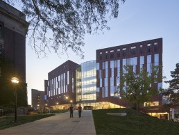
University of Michigan Biological Sciences Building, USA
The new Biological Sciences Building at the University of Michigan features vast, daylit atria that put the school’s research and artefacts at the forefront. These daylit spaces are complemented by a seamless lighting design from SmithGroup.
Combining state-of-the-art science education with research spaces and an interactive natural history museum, the Biological Sciences Building (BSB) at the University of Michigan is a first-of-its-kind facility, designed to engage the public and revolutionise life science research, discovery and communication.
Designed by SmithGroup and Ennead Architects and located on the university’s main campus in Ann Arbor, Michigan, the 312,000sqft facility is characterised by a transparent, open-lab concept, and brings together five biological sciences departments from across the campus. The site also merges these departments with the newly re-envisioned Museum of Natural History, giving the larger community access to the research coming out of these programmes.
The building form was influenced by close collaboration between the University, SmithGroup and Ennead, utilising network mapping tools intended to enhance interaction between disparate groups. The resultant form is that of three closely spaced, terracotta-clad, five-storey laboratory pavilions, broken open on the south side and connected by two vast glass atria, creating views into the facility and bringing natural daylight deep into the laboratories and public spaces. These atria also serve to showcase the institution’s mission to educate the public, acting as giant display cases for large-scale exhibits.
Rodrigo Manriquez, Principal at SmithGroup, explained this design concept further: “This project was an effort to open up the otherwise very conventional, closed towers typical to lab buildings, opening them up into the campus environment and the campus fabric.
“In an effort to divide the three towers, we have two atria conditions that create a relationship of solid and void. For us, it was really essential to understand this architecturally, to be able to have an input in terms of light and dark, and orchestrate the solution accordingly. The concept of portals guided our thinking.”
As such, SmithGroup, alongside Ennead, carried out detailed parametric daylighting analysis, which then informed both the façade design and the glazing choices, ensuring that plenty of natural light penetrated deep into the building without creating any unwanted glare.
One of the core facets of the brief given to SmithGroup and Ennead was to “put science on display”. Jarrett Pelletier, Associate Principal at Ennead, explained further: “Our team worked with the University to elevate this ideal and to echo it at many scales. Breaking the machine-like qualities of a traditional research building apart into multiple towers both drove daylight deep into the working spaces, but also allowed views from the exterior into the research laboratories and collections. Like a contemporary ‘cabinet of curiosities’, the museum’s towers fold open to reveal the innerworkings of the scientific process.”
Matt Alleman, Principal at SmithGroup, elaborated on how lighting design fit into this design brief: “We weren’t given specific direction as to how the lighting solutions should evolve. Rather, we worked in concert with the designers and the university’s brief to create a cohesive lighting concept that further elevated the building’s form and function. It wasn’t a separate thing, it was one and the same.
“I think that’s what worked really well in the synergy between SmithGroup and Ennead in terms of developing the architecture and the lighting systems that accompany it.”
“We pushed to integrate the lighting into the architecture wherever possible, and to use the lighting as architecture,” added Pelletier. “It was a highly collaborative framework where we set a vision and SmithGroup came back with different ways to address that vision, and we worked together to find the right answer.”
As part of this synergistic approach, SmithGroup developed the idea of creating “scientific portals” – a concept that uses day, night, research and exhibit portals to unify the building by strengthening visual connections between the programme, users and visitors.
“The building has great touch points for the interface of a human scale, an articulation that brings out the activity of nearby spaces on the inside,” Manriquez said. “Lighting is actually allowing the typical trick of diluting the glazing into the environment and capturing critical moments. It plays at different scale, and that connection is something the team really took pride in – understanding that the building is experienced at different rhythms, but that connection of scientific portals was always the guiding principle.”
The fluidity between the architecture and the lighting design extends to the contrasting typologies within the building, as students and visitors experience working laboratories, study spaces, and museum exhibits under one roof. While this project could have felt like a number of smaller, self-contained projects, SmithGroup ensured that there was a commonality in its lighting design to connect each space.
“By our description of how you experience the spaces, you might feel that the lab spaces for example, could become very segregated from the rest, but the reality is that we’re putting these spaces on display,” Manriquez said. “That’s how we connect to this notion of scientific portals, whether you’re on the inside, or you’re in the atrium looking in, you have the ability to see the artist on display, if you will.”
“We talked about the different space types, where you can move from an exterior walking path, to a museum exhibit, to a working research lab – they’re all very different environments, but it was critical that we have a common language to solve them, because the idea of this project was that they can be visually connected,” Alleman added. “So we used common approaches that worked well together in solving these very different environments, such that the visual connection would make sense, and that it wasn’t a whole disparate number of different types of space coming together, because there was intentionally a visual connection.”
A primary factor in creating this visual connection is the illumination for the two atria. These vast, fully glazed spaces, spanning the five storeys of the building, fill the inner reaches of the BSB with natural light – even reaching into labs that have no external windows. Complementing this abundance of natural light, SmithGroup opted for a layered artificial lighting approach, starting with a crisp, ambient light to the canopy ceilings, then the artefacts on display, before illuminating the staircases through recessed, linear fixtures from LED Linear and downlights from Lucifer, and then the smaller display cases and labs.
“If you look at the atrium as the macro, and then the lab volumes and even the individual display cases, the layers and approach to lighting that we’re using are consistent throughout all of those,” said Patrick MacBride, Lighting Designer at SmithGroup. “We created a luminous top, and have strategically located point sources to highlight the artefact within that volume, and those were two of the guiding principles that we utilised in every one of those areas.
“In the display case, we added a luminous ceiling to the case, courtesy of Cooledge Lighting, and we had integrated adjustable accent fixtures from Bruck Lighting to specifically highlight the pieces on the shelf, so it was always very intentional, even down to the display case integration of light.”
To create the luminous ceiling of the atrium, 42 theatrical floodlights from ETC are concealed within wall pockets at the third floor level to illuminate the curved, billowing form. However, reaching this decision took a degree of trial and error by the lighting designers, as MacBride explained: “The form bows in two directions, and if you don’t light it correctly, it flattens out and it looks like a flat ceiling, which completely undercuts all the coolness of this ceiling system.”
“Where we started with the lighting for the ceiling was to light it from the edges, but we found looking through options that there was no way that we could truly articulate the form from those edges; we flattened it out every time, and found that we needed to change the location of the light sources. We worked with Ennead to integrate that into something that was palatable within the space, and created a tectonic that made sense and really blended with some of the exhibit lighting in that space to become one element,” Alleman elaborated.
Each floodlight is carefully aimed, lensed and dimmed to create an intentional gradient of light emanating from the centre of the ceiling. This indirect illumination from the five-storey volume provides functional illumination for the ground floor.
With this stretching, uplit ceiling canopy, it was important for SmithGroup not to over light the space with further illumination to the suspended fossils that hang in the void. Alleman explained that instead of highlighting them through light, it became a balancing act between “embracing the notion of silhouette, but making sure that we weren’t losing detail”.
“One benefit was that because these pieces were being transitioned from an existing museum space to this new space, we were able to go in and really understand the materiality. This was critical because if we don’t get the material right, we don’t get the luminance right, and we don’t get the hierarchy.”
The push for a hierarchy of light extended to the different light levels within the atrium during daytime and at night. This meant that while the atrium is flooded with natural light during the day, more light was put on the ceiling during the day than after dark. Alleman explained: “The reason for that rolls back to the hierarchy of luminance required in a daytime scenario, to make sure the brightness of the ceiling was aligning with and complementing the brightness of the exterior surround.
“So, whereas some would assume that during the day you would dim that space because there is abundant daylight, it was really important, at least for the ceiling element, that it becomes brighter during the day, and then it was able to dim somewhat at night too.”
Understanding the materiality was another key consideration for the lighting designers throughout the project, as SmithGroup worked to ensure there was a consistency of materiality in every location – tying in with the push for consistency in the overall project. “Every place you see a wood wall, it’s being treated in similar conditions, there’s a perimeter brightness at the top, so it feels as if it’s projecting through, and it has a wall wash layer to it,” Alleman explained. “So, every place that materiality shows up, there’s a consistency, which again helps to layer onto the overall project feel – everything feels tied together.”
The end result is a space in which the lighting is seamlessly integrated into the architecture, becoming one entity that celebrates biological sciences and the work of the university.
“From the larger architectural features highlighted by the dynamic lighting, to the details of the common display cases and flexible fixtures in the exhibit halls, the lighting design works in tandem with the architecture,” said Pelletier.
“It is important to us to make spaces that feel inspiring and that are uplifting places to work and visit. The design of this building was meant to inspire future generations to become scientists. It’s a very human-centred building, designed to support science on many levels. The distribution of daylight across the building makes such a difference in the quality of the experience for the occupants.”
Manriquez was equally pleased with the outcome. He concluded: “The concept guides the decisions that we make, but eventually the assessment is done by the user. Everybody is ecstatic about the opportunity to come together and collaborate under one roof.
“The concept is one thing, the actual perception of the space needs to be intuitive, and I think the project does that, and functionally it is doing what we set out to do. The user doesn’t really know or care who behind the scenes created their space, they just need it to be a comfortable and functional space. I think we provided that.
“It’s a great addition to the campus, and the feedback that we’ve had from the client is a wonderful testimony – it has been used by the university as a great recruiting tool, as an attraction for new talent and retention of faculty. It has become an institutional destination, which is fantastic.”


