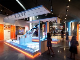
US Olympic & Paralympic Museum, USA
The recently opened US Olympic and Paralympic Museum has been expertly designed to showcase Team USA’s illustrious history in an inclusive and accessible manner. Lighting designed by Available Light and Tillotson Design Associates helps to create this inclusive atmosphere.
Situated at the base of the Rocky Mountains in Colorado, the US Olympic and Paralympic Museum is a monumental tribute to the efforts of the United States’ Olympic and Paralympic athletes.
Spanning 60,000sqft, the inclusive, accessible site designed by Diller Scofidio + Renfro Architects, with architectural lighting designed by Tillotson Design Associates, will act as an anchor for Colorado Springs’ new “City of Champions District”, forming a new axis bridging the city’s downtown district to the America the Beautiful Park.
Inspired by Team USA’s inclusive values, the museum is the first to be dedicated solely to the nation’s achievements in both Olympic and Paralympic Games, and has been designed with accessibility in mind – its dynamic, spiralling form allowing visitors to descend the galleries in one continuous path. This structure and form means that the museum ranks amongst the most accessible in the world, ensuring visitors with and without disabilities can share the same common experience.
This experience, with 20,0000sqft of museum exhibits designed by Gallagher & Associates – with lighting design by Available Light – looks to immerse visitors into the intensity of high-level competition through the lens of the athletes who have trained, competed and won. It is hoped by the exhibit design team that the experience will “forever change people’s perception and appreciation for the dedication, motivation, determination and sacrifice that all Olympians and Paralympians share”.
Externally, the museum is a glowing, angular structure comprised of more than 9,000 folded, anodised, diamond-shaped aluminium panels, each unique in shape and size. This aluminium “skin” wraps four overlapping, petal-like volumes that spiral around the internal structure. Each metallic panel is animated by the extraordinary light quality in Colorado Springs, producing gradients of colour and shade that give the building a sense of motion and dynamism.
This is complemented by an artificial lighting scheme created by Tillotson Design Associates, who were brought on board by Diller Scofidio + Renfro. Megan Trimarchi, Senior Associate at Tillotson Design Associates, explained the design concept for the building’s striking exterior further: “The brief challenged the design team to create a connection to Vermijo Ave, the bridge, and the America the Beautiful Park as extensions of the museum site.
“After seeing the selected façade material and unique form of the building, we knew we wanted the building to have an overall soft glow at night. We also knew we wanted the building to have a subtle lighting effect, resulting in an iconic and recognisable nighttime presence while also being mindful of the relatively dark context around the site.”
The continuous ramp also doubled up as the egress path through the exterior site, which resulted in very specific light level requirements, as the lighting team sought to make the path seamlessly blend with others on the site – one of the main challenges that they faced.
“The architect also had a strong desire to maintain the view from Vermijo Ave, across the site and to the mountains beyond. This meant keeping certain areas clear of light poles, so pole locations and heights were constrained in an effort to make this happen.”
Closer to the building itself, the unique façade detailing lent itself to a soft illumination, as Trimarchi explained: “We found that the aluminium panel façade material captured light beautifully when softly floodlit from a distance, so we arranged LED floodlights mounted to high mast poles on each side of the museum to achieve this effect.
“The challenge was that the site boundaries and areas within key views limited our pole locations, so we had to get creative. In some cases, we even mounted façade floodlights to street lighting poles.”
Trimarchi and the Tillotson design team worked very closely with the architect throughout the project, although they were given the freedom to come up with their own schemes that would complement such a striking piece of architecture. Trimarchi continued: “Our designs typically integrate light fixtures into architectural details whenever possible, so the emphasis is on the architecture rather than the light fixtures, so working closely together, particularly for detailing, is essential.”
Alongside the remarkable building exterior, Tillotson Design Associates worked on the lighting for the interior atrium. Trimarchi continued: “We wanted the atrium to be the heart of the project with brightly lit walls. Sculpturally this is where the spiralling architectural forms culminate to one central space, so we wanted our lighting to emphasise that.
“We also wanted to conceal fixtures so that when looking up, only the light on the wall was visible and not the fixture itself. This was particularly challenging technically, because the walls are sloping in two directions and the upper ceiling of the atrium walls are highly visible from the gallery floor viewing platforms overlooking the space.
“For this reason, we used individual wall washer track heads mounted on the clerestory windowsills so that we could aim straight down despite the sloping mounting surface. Tucking the fixtures up in this spot also helped minimise views into them while still allowing the light to spill down the walls. The effect is a truly magical space, and we are really proud of how it turned out.”
The atrium was also an area where Tillotson’s lighting design overlapped with that of Available Light, who developed the lighting for the museum’s exhibition spaces. Trimarchi explained further how the two studios worked together to create one cohesive lighting experience: “We had several discussions, mainly about the transition zones between public space and gallery space where our scopes meet. All of our lighting required a sensitivity to the adjacent exhibit spaces, which typically employ very low light levels. The architectural lighting required excellent low level dimming to achieve the required flexibility on site during programming.
“For a museum like this with such an extensive exhibit component, it is typical that there are different lighting practices working on different aspects – we always enjoy collaborating with other teams, and it was certainly a pleasure working with Available Light to bring this project to life.”
On entering the museum space, which stretches across three floors, visitors take an elevator to the atrium’s “peak”, where a spiralling sequence of galleries takes them through this history of the Olympic and Paralympic Games, while a number of interactive exhibits give visitors the chance to try their hand at the various training methods that Team USA athletes have gone through over the years.
Ted Mather, Principal of Available Light’s New York studio explained the lighting concept for the sprawling museum spaces: “Because of the very nature of the Paralympic movement, one overarching goal of the client was to create a world-class visitor experience presented with state-of-the-art inclusivity and accessibility techniques and guidelines. The US Olympic/Paralympic Committee was also interested in creating an environment that was uplifting, inspiring, and reflected the high energy and intensity common to the best athletes in the world.”
Available Light therefore hoped to design a lighting scheme that created “the appearance of clean, bright white light throughout – with its connotations of honesty, transparency, truth, height, etc, while using saturated colour in the periphery to emphasise passion, diversity, energy and excitement”.
Mather continued that this inclusive concept was brought to life, mainly through crisp and clean application of colour and angle. He explained: “Because many artefacts were light sensitive, we used a limited number of fixtures, at sharp angles and tight beam spreads; by creating contrast with the background, the impression of intense light, reflective of the power of sport, was made possible without causing undue damage to the artefacts.”
Accessibility was also a key parameter for the project as a whole, and as such extra measures were taken by the lighting designers to ensure that the lighting was tailored to a more inclusive, accessible environment. This was done, Mather said, by firstly being “aware of this critical point of view”.
“Objects and graphics always reflect light and cause glare when viewed from certain incident angles, consequently we are sensitive about where a fixture is located, so the resultant glare is directed away from where visitors’ eyes are likely to be. In this case, the point of view of someone at a lower level – in a wheelchair, for example – had to be regarded as a high priority.”
Throughout the project, Available Light worked closely with exhibit designers Gallagher & Associates, as well as Diller Scofidio + Renfro to create a scheme that was suitable for the exhibition spaces, while also remaining “highly integral” to the wider building design. “Diller Scofidio + Renfro had a strong interest in bringing daylight into the exhibit spaces and allowing for views to the outside and the extraordinary Colorado landscape,” Mather continued.
“The interiors were meant to be light, airy and uplifting. Creating an environment that gracefully transitioned from daylight to darker areas where video projection was used, or light sensitive artefacts were displayed, was complex and challenging, but was ultimately very successful.”
This challenge was complicated further by the building’s angular structure and constantly shifting angled ceiling planes. While Mather felt that such unique geometry made his job harder, he added: “But like a lot of great art, challenges demand your best effort, and force you to come up with very thoughtful solutions.
“It’s Occam’s Razor – find the simplest way to solve a complex problem, and you’ve probably done the right thing.”
Mather explained that Available Light worked with the building architects to create a lighting system that was flexible enough to accommodate the unfolding exhibit design, while they also collaborated with Gallagher & Associates on integrating lighting into exhibits where possible, particularly in instances where the geometry of the building infrastructure did not align with the exhibits.
As Mather described, the museum space comprises a range of light sensitive artefacts, as well as areas with video projection. This can complicate matters for the general exhibit lighting, however, he explained how the design team was able to overcome this. “Control is key. It is about using a large number of small paint brushes of light instead of big washes. Those smaller strokes allow us to strategically avoid video projection surfaces, control light levels on artefacts, and direct focus to what is important,” he said. “This high level of lighting control brings a sense of drama and gravity to the moment.”
As with any project from the past 12 months, the US Olympic and Paralympic Museum was completed at a very unusual time in our history, with Covid-19 impacting on the way that all of us have been able to work and interact with each other.
This was certainly no different for Available Light and Tillotson Design Associates, who each had their own struggles in working through the pandemic.
“The impact we felt was mostly on executing the final on-site design work,” Mather said. “We worked in shifts from 2pm to midnight for focus to reduce overlap with other contractors. At the end of the day, we would take photos of our progress and email them to the client for comment, since they were not yet on site. That required Photoshopping about a hundred pictures a night, since the camera sees light very differently than your eye – I would adjust them to what it looks like in person, not the way a digital sensor sees light and colour.”
Trimarchi added: “Covid certainly complicated our final punch listing and focusing, which ended up being done remotely and condensing our work into fewer trips. It also greatly delayed the site and façade lighting portion of the project, which followed months after the interior was finished due to delivery delays.”
Despite these unforeseen constraints, both Tillotson Design Associates and Available Light were able to create a combined lighting scheme that showcases both the exhibits within the museum, and the building itself.
“While the detailing and execution of the lighting effects evolved over time, our initial objective of softly lighting the striking structure from the exterior and brightly lighting the central atrium as the genesis of the spiralling form carried through to the final design,” said Trimarchi. “The lighting emphasises the architectural form, both inside and out, which was our primary goal for this project.”
Mather added: “I think we were quite successful in creating a sense of drama and energy that effectively supported the content. The spaces flow well visually, but different galleries are distinct in character. The balance between artefacts, projection surfaces, graphics, and exhibit elements is refined and graceful.
“Necessity is the mother of invention – the architectural and exhibit design teams challenged us with innovative technologies and forward-thinking designs that brought all our skills and talents to bear. The coordination and cooperation required to execute the design truly honoured the Olympic spirit!”


