Wiley Publishing, USA
New York-based One Lux Studio has created a lighting scheme for the newly renovated headquarters of Wiley Publishing, utilising both direct and indirect light to open up and revitalise the formerly dark, enclosed space.
Wiley Publishing, formerly John Wiley & Sons, has been in operation for more than 200 years, since its inception as a small printing shop in lower Manhattan in 1807. The family-run firm, now into its seventh generation, has constantly evolved over its 210-year tenure, from letterpress pamphlets to digital apps and interactive online learning tools, and now this evolution has extended to its workplace, following a renovation of its company headquarters.
Located in Hoboken, New Jersey, with beautiful views of the Hudson River and Manhattan beyond, the interior renovation has transformed the offices into sophisticated, open workspaces, while the large windows fill the space with natural light.
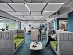
Working alongside architects TPG Architecture, Manhattan-based One Lux Studio designed the lighting for the newly renovated headquarters, providing new solutions not only for the office space, but for public areas also, including the ‘collaboration lounge’, elevator lobbies and cafeteria.
Using a blend of decorative and architectural fixtures, the new lighting scheme utilises both direct and indirect fixtures following the workstations, while linear indirect uplighting at the core highlights the edges of the space. The public areas incorporate more playful lighting elements, with zig zags, angular and organic patterns of lighting blending with the ceiling system, revitalising the space.
Stephen Margulies, founding partner of One Lux Studio explained how the new scheme helped to transform the offices post-renovation. “The existing space had enclosed perimeter offices, which affected daylight penetration,” he said. “The interior open plan areas were dark, vast areas with tedious grids of 2×2-foot fluorescent troffers with little definition or interest.”
The goal for One Lux Studio, therefore, was to develop a lighting system that took advantage of the new open plan concepts. However, Margulies was concerned that, in doing so, they’d end up with large, open areas with “monotonous” lighting solutions.
“Careful attention was placed on creating interesting arrival and circulation design solutions, and the workstation areas had a ‘neighbourhood’ approach where the light fixtures are related to the workstation zones, creating brighter zones at the workstations and darker zones in the circulation areas. We created spaces that were intimate within a vast floor plan,” he explained.
“Additionally, a large format, 4×4-foot ceiling tile was used for the workplace. This, in conjunction with the indirect lighting components, created a unique solution.”
The use of indirect uplighting throughout the project circulation areas, provided by EcoSense, adds an interesting dynamic to the space not normally seen in office environments, and Margulies explained why One Lux Studio made this decision: “The ceiling heights were pretty restrictive,” he said. “Acoustic tile ceilings needed to be at eight foot, ten inches to conceal major mechanical systems.
“Large open spaces with this ceiling height can feel compressed, so the concept of using a direct/indirect lighting solution for the workplace proved to enhance the volume of the space.” Major circulation areas made use of exposed ceilings, adding an element of ‘rawness’, while also enhancing the spaces by providing even greater volume and variety. Elsewhere, a patterned ceiling effect in the elevator lobby, and lowered, zig zag panels in communal areas bring a sense of playfulness, further differentiating the various spaces.
However, while the ceiling proved restrictive in some areas, there were other occasions where the lighting team were able to elevate them higher, further enhancing the new, open feel of the headquarters.
“The existing mechanical systems were kept in place, which created a few challenges for some areas,” explained Margulies. “Since the workplace lighting hung below the ceiling we avoided many conflicts, and allowed the ceiling to be as high as physically possible.
“There were a few surprises when the existing ceilings were removed; however, recessed lighting equipment that only required 3.5-inches of recess depth avoided most conflicts. This coordination became most important in the amenity spaces like the conference centre and food service areas, where ceiling heights were pushed even higher to enhance the user experience.”
As with most projects, budget proved to be a big driver for One Lux Studio, but Margulies and his team found that their approach – particularly the blend of direct and indirect lighting – used very few light fixtures when compared to traditional open office lighting solutions. However, by referencing other projects where similar solutions were successfully implemented and carrying out tests to prove the concepts, they were successful in getting these solutions in place.
The end result for Wiley Publishing’s new headquarters is a bright, airy, interesting workspace, awakening an office that had previously felt dark and vast, underutilising the space available. Margulies was delighted with how the project has turned out, praising the work of TPG Architecture.
“The architect has created a new, unique experience for the Wiley employees,” he said. “As the space was recreated in an existing office building, the comparisons were immediate.
“Daylight and fantastic views of the Hudson River were magically awakened. Large, tedious spaces were transformed into ‘musical experiences’, having the beat change as one walks through the space.”


