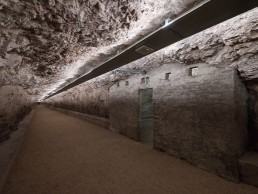
Zerostrasse, Croatia
Connecting the Croatian city of Pula, Zerostrasse is a labyrinthian network of tunnels and passages with a gallery at its centre. Local design studio Skira Architectural Lighting developed a lighting scheme for the tunnels that improves accessibility, while showcasing their heritage.
Hidden beneath the Croatian city of Pula lies a series of interconnected, underground tunnels. Built at the time of the Austro-Hungarian Empire, the subterranean labyrinth was used to shelter the city’s population during air strikes on the city during World War I.
Now, the network of tunnels, shelters, trenches, galleries, and passages, dubbed Zerostrasse, has been repurposed into a pedestrian metro, with a central gallery, and a vertical elevator connection to the Historical and Maritime Museum of Istria, which sits atop Pula’s highest hill.
As part of the renovation of the tunnels, led by architect Breda Bizjak of BB Arhitekti, Pula-based lighting design studio Skira Architectural Lighting was appointed to develop a solution that would provide comfortable linear lighting along the 2,700sqm of tunnels.
Dean Skira, Founder of Skira, explained how the studio first joined the project, and how the lighting concept developed: “The town authorities invited us to submit a bid for an initial lighting design concept for Zerostrasse several years ago, as is often the case for public projects. Our bid was accepted, and we were appointed to develop the lighting scheme for the network of tunnels.
“The collaboration with Breda Bizjak was very open and constructive; she was exceptionally familiar with the project, as she presented the concept of its revitalisation as a student. About 20 years later, the idea grew, and the project started with its active role in preserving the fortification heritage and improving accessibility for the museum and its new exhibition space. This indicated that the lighting design had to be immaculate.”
While the reconstruction of the tunnels created new opportunities for movement within the city, the isolation from external influences – particularly daylight – influenced the lighting design concept, as did the raw fabric of the site.
Skira continued: “The concept was apparently as simple as the elements of the project. But when you start to work, you notice the details, the constraints, the collaboration flow, and the overall complexity.
“The lower assembly was built in living rock, so during the renovation, great attention was paid to the preservation of the rock mantle, which necessitated the collection of all electrical installations in one route under the vault, which we then decided to use for the placement of lighting. This assured that no additional elements were added to the space. The complete lighting system needed to be controllable and easy to maintain. The intention was that the tunnels became a new attraction, and a pleasant shortcut from one side of the town to the other.”
Within Zerostrasse, there are two sets of underground tunnels on two levels: the lower set at city level, and an upper complex, lying below the fortress and museum at the top of the hill. The historic network of Pula’s streets, spread out in several concentric rings that organically adapt to the hill’s topography, are cross-connected, and complemented by the underground tunnels, that run in four different directions.
While the idea of illuminating a series of historic underground tunnels may sound like a challenge, for Skira, who has experience in such locations, the prospect wasn’t any more daunting than any other project. “Projects bring along challenges when you care about the result and take responsibility for it, regardless of the location,” he said. “We have had several interesting underground projects realised, like the Postojna Cave and the underpasses in Zagreb, with a lighting theme inspired by the metro map. We are currently working on a peculiar tunnel in Bakar, Croatia, as well.
“However, Zerostrasse was unique. Although it’s a kind of an underpass, the purpose is multifunctional and adaptive, but at first not strictly defined. We had to consider this, alongside humidity and leakage, low ceiling heights, and the preservation of the rock mantle. As well as this, the only surfaces that were physically intervened were the concrete floors and the vertical shaft of the elevator, which is located at the intersection of the corridors.”
The new lighting for the tunnels has been kept deliberately subdued, with linear fittings softly uplighting the cave ceilings. Placed in the metal constructions just below the ceiling surface, the fixtures are hidden from view while delicately illuminating the rocky texture of the tunnels.
Skira explained why the design team opted for a clean, minimal approach for the lighting: “Lighting is always essential in dark spaces, and the lack of windows or natural light influenced our motivation to make the area feel more breathable by providing clear and long-distanced visibility of the tunnel and its natural stone.
“We decided to keep the lighting to the lowest possible level, while still being in accordance with the norms and recommendations. The solution therefore provides comfortable linear lighting along the hallways. There is a gradation in lighting at the entrance points – the light intensity increases when you walk towards the exit for a more comfortable eye adaption. During the night-time, these lights are lowered in both directions.”
Alongside the functional linear fixtures, Skira created pockets of intrigue at points along the tunnels, with red flashes of light illuminating cave holes in the ceiling. He explained the process behind this decision: “When designing lighting, we balance and even rein a very powerful tool, which influences our field of vision. Our impulse is to provide visual pleasure and to make a pleasing environment and conditions for other activities. In private and public spaces, the light should bring joy, help people feel better, and also surprise and entertain them where possible.
“The holes in the living rock intrigued us, and it was clear that we should enhance them and make them attractive, thus they become a focal point for the use of red light, which is the colour of the earth’s core as we imagine it. The effect is hidden, it’s mostly not that visible from a distance, it’s an element of surprise.”
In the gallery space at the heart of the tunnels, which is used for exhibitions, music events and similar activities, additional linear lighting circles central pillars, providing increased illumination for the works of art on display. This is then further enhanced by “pop-up lighting solutions when necessary”.
Since completion, Zerostrasse has received plaudits from across both the design community and the general public, picking up a trophy at the 2021
[d]arc awards in the process. And Skira is grateful for the recognition. “We are humbled by every single award received by fellow professionals,” he said. “We strive to provide projects that push the boundaries of the profession and really embrace challenging projects.
“Zerostrasse affects the redefinition of public space and infrastructural communication networks by providing new opportunities for movement. The isolation from external influences – public content, atmospheric conditions, daylight and sound – is the opportunity for developing a specific multimedia exhibition space. The establishment of vertical communication between the tunnel and the fortress, and the high-quality lighting, made access easier for visitors with disabilities, while the museum has already recorded a significant increase in visitor numbers.
“We wanted to provide a high-quality lighting solution that would ensure a ‘wow’ effect; people seem to recognise this and react to it. Many visitors during tourist season walk through Zerostrasse and post photos to social media with positive comments; they share their experience and enjoy the venue, so our goal is achieved.”


